2025
6″ x 3″ x 4″
Bronze


2024
15″ x 8″ x 1.5″
Bronze
My relationship to my phone is officially “it’s complicated.”


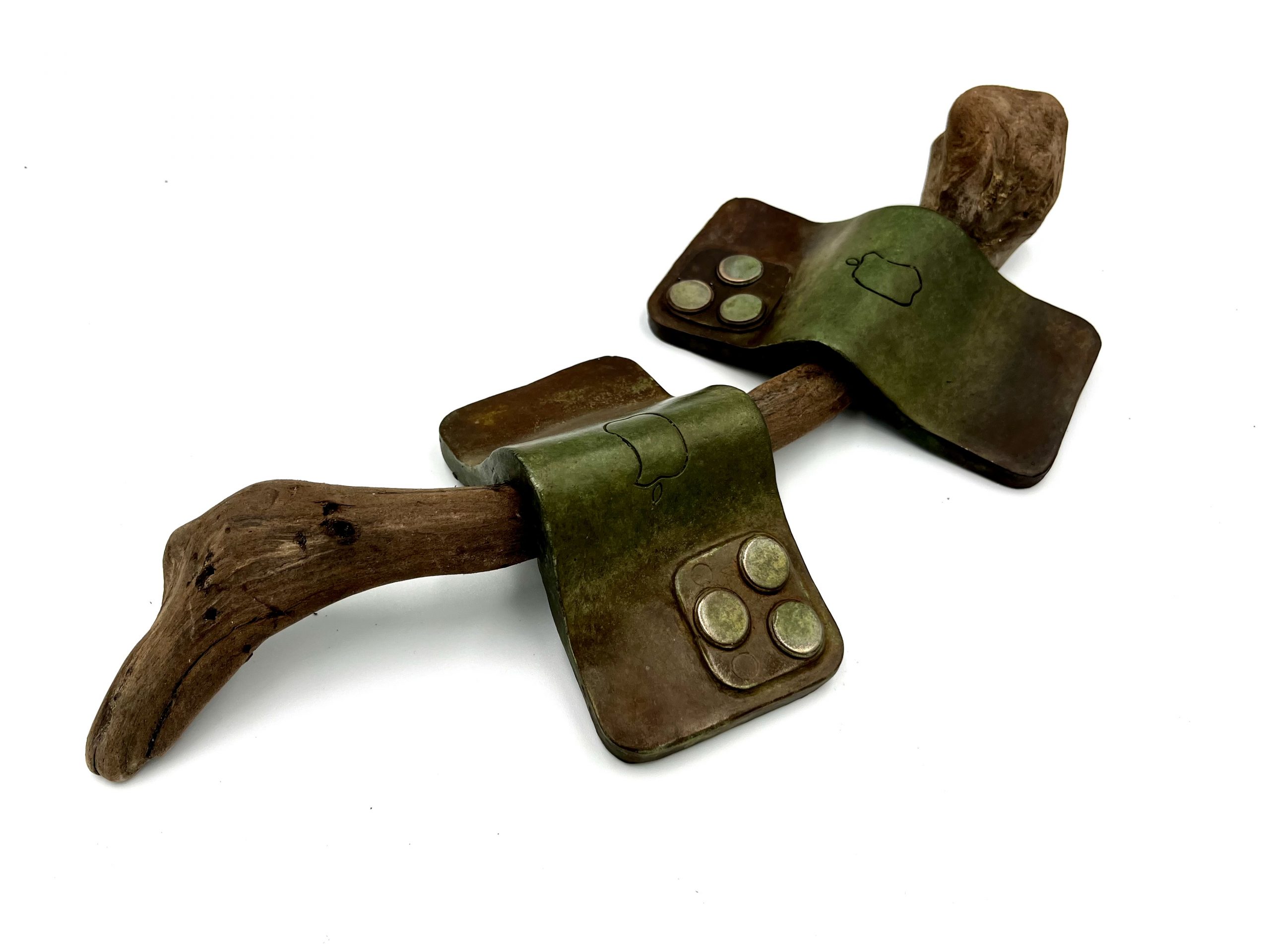
2024
14″ x 6″ x 2″
Bronze, found driftwood
Found these cute little guys when I was out on a walk in the woods.


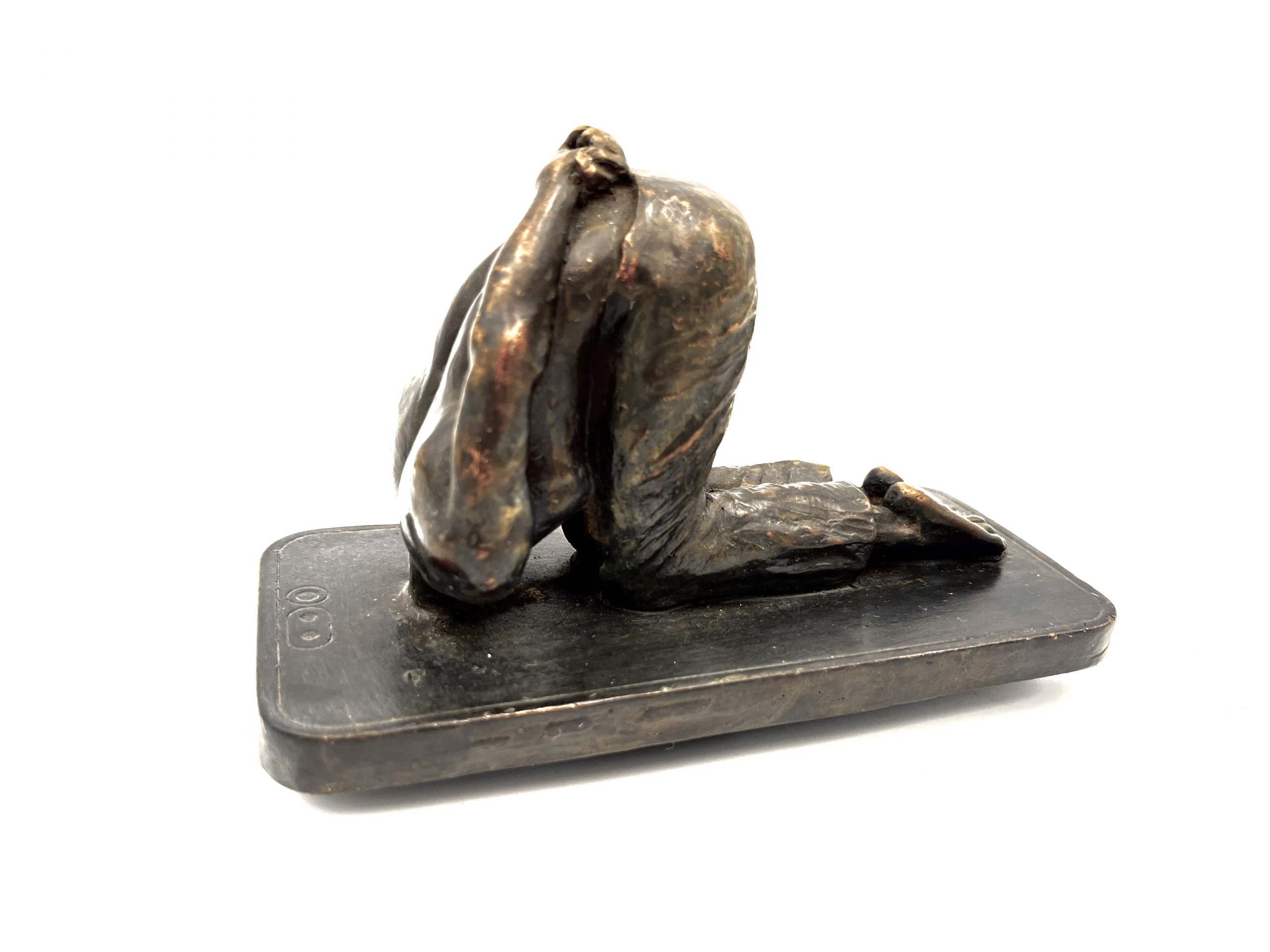
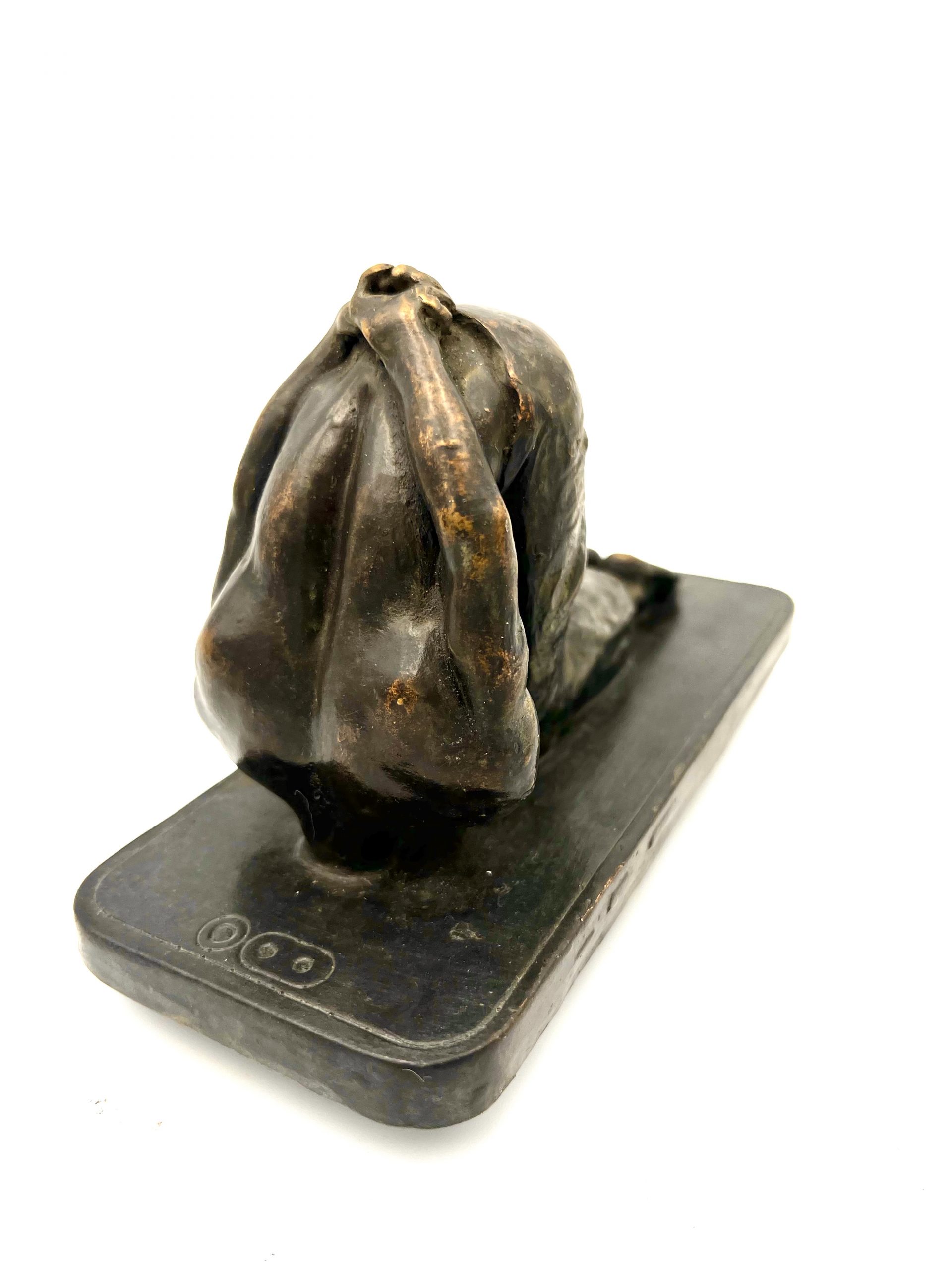
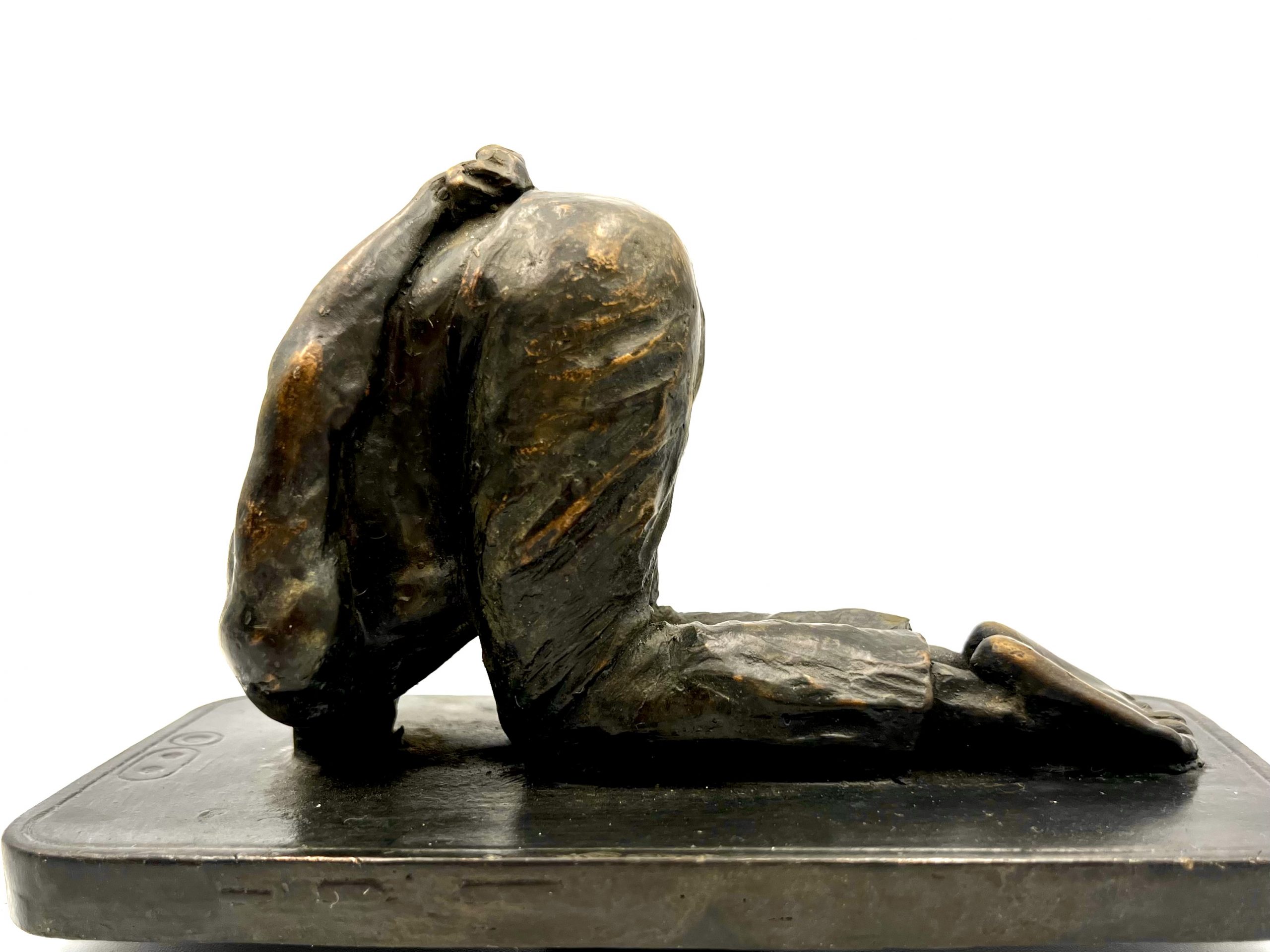
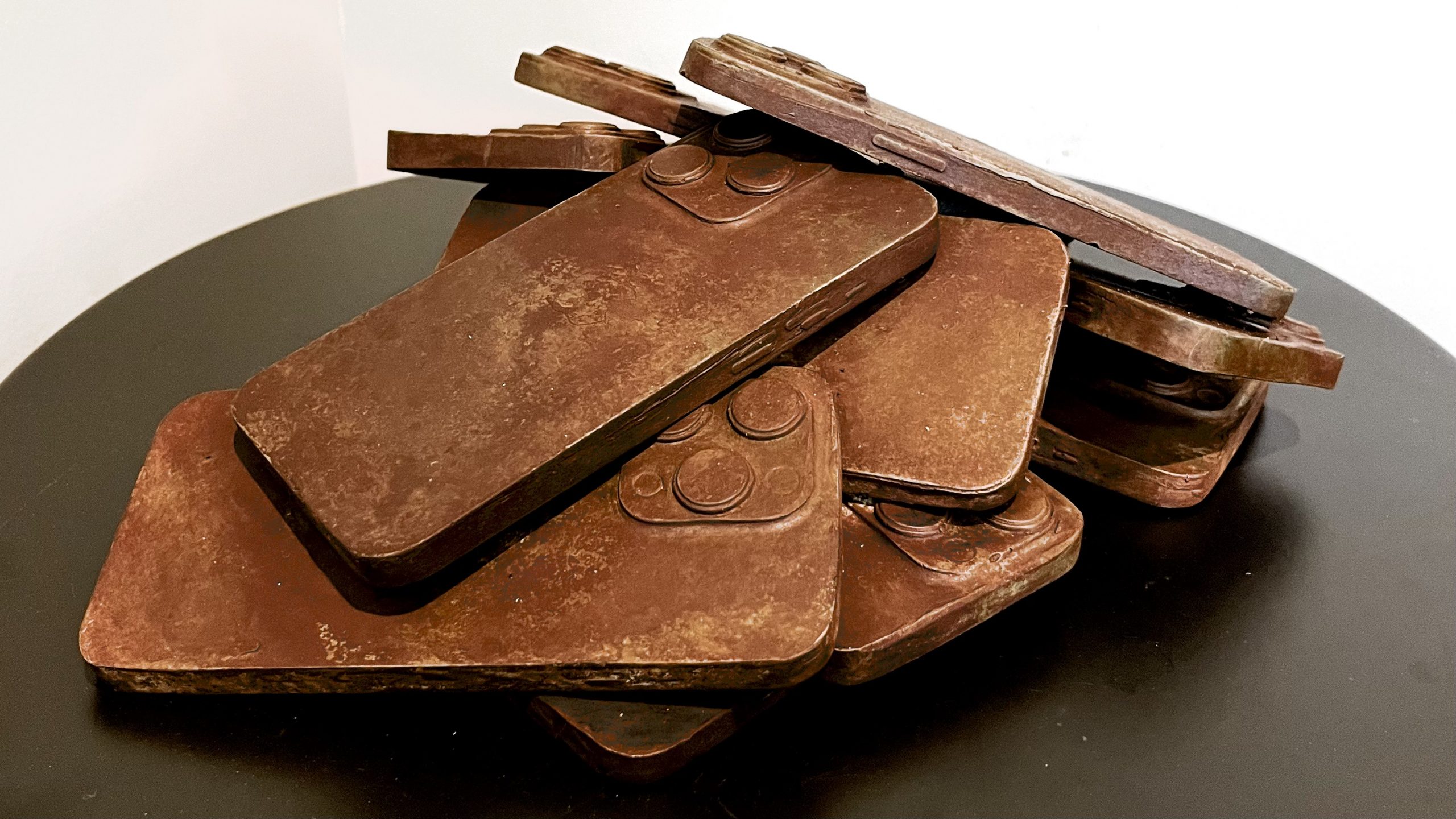
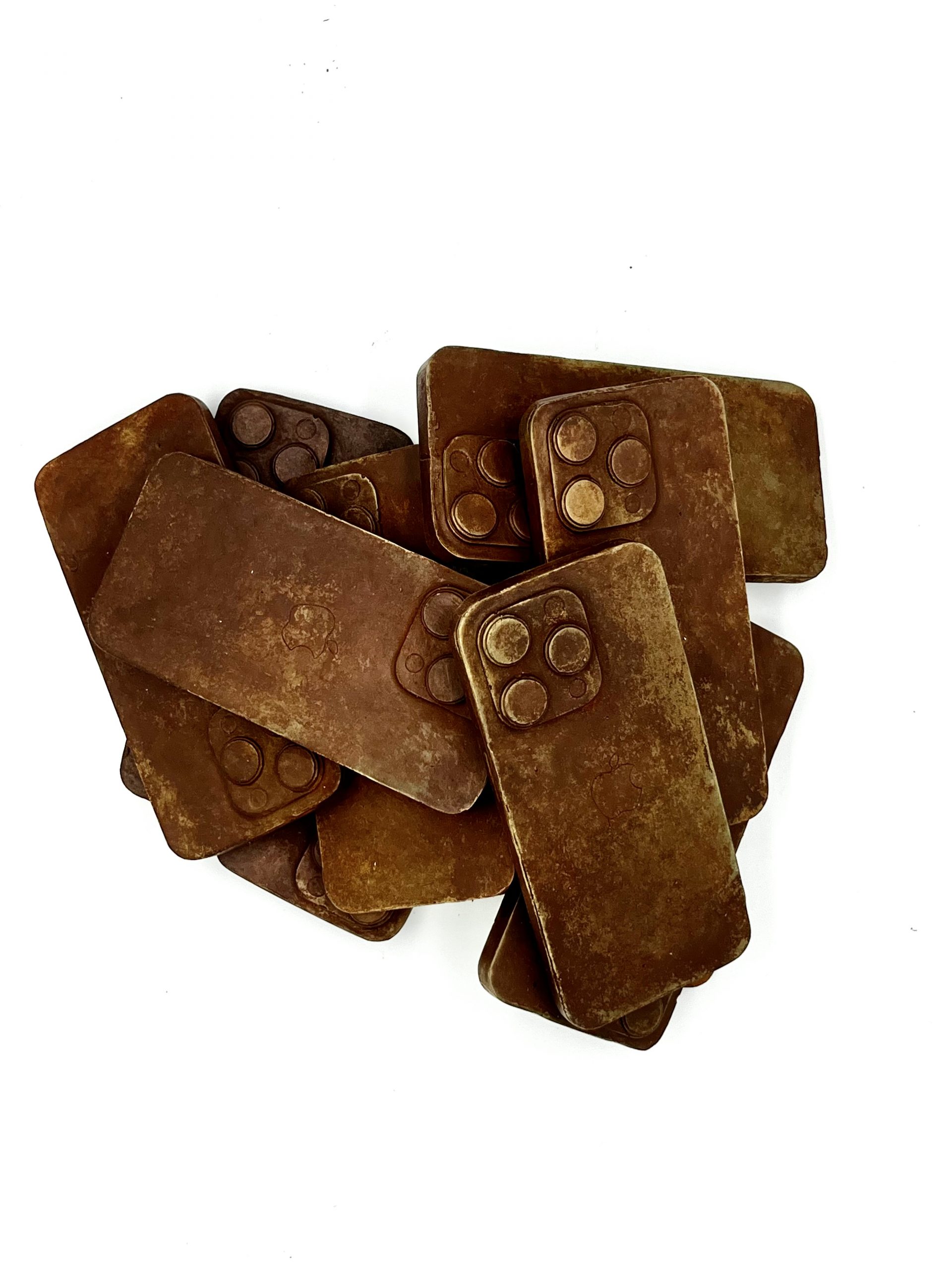
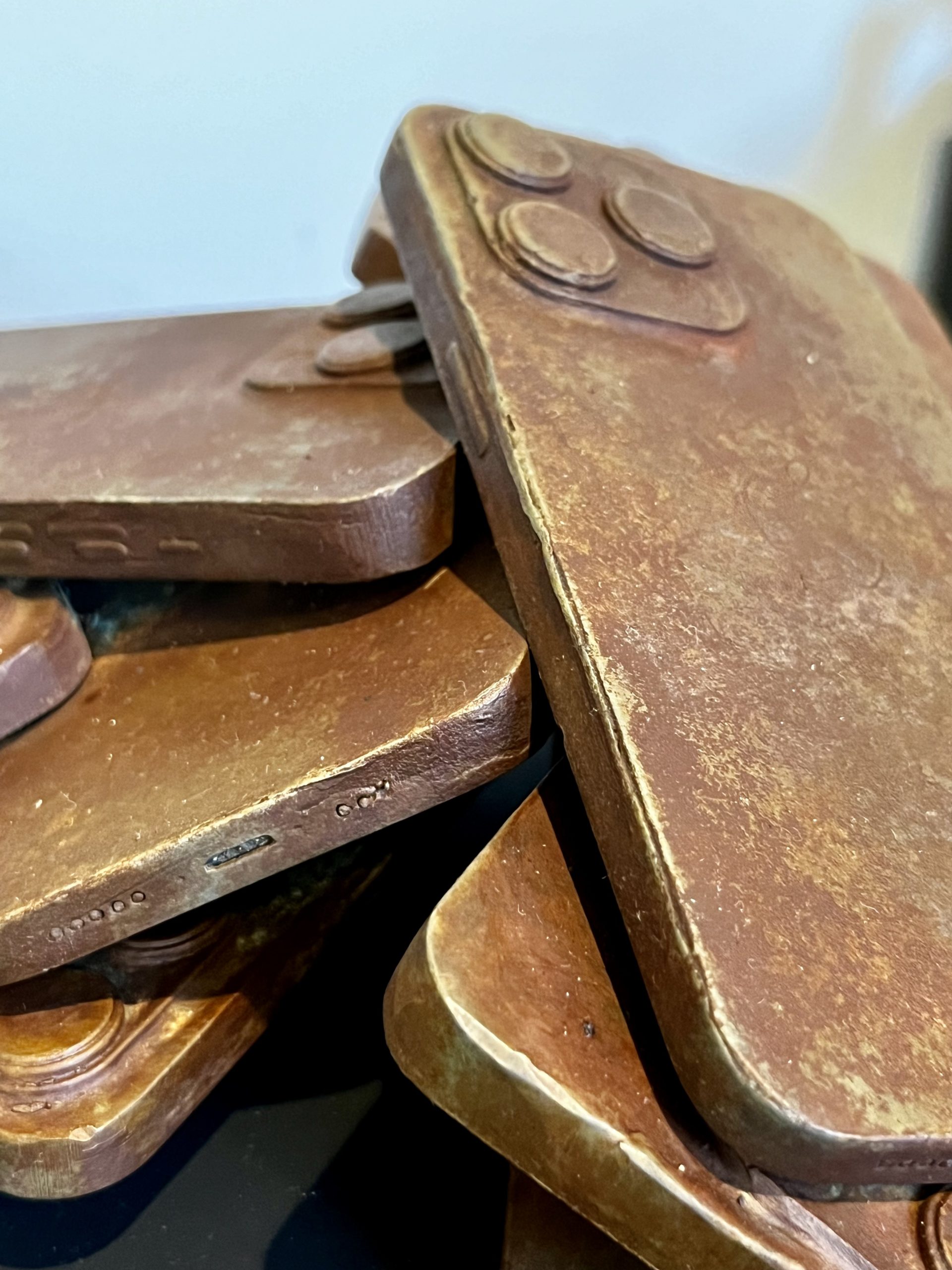
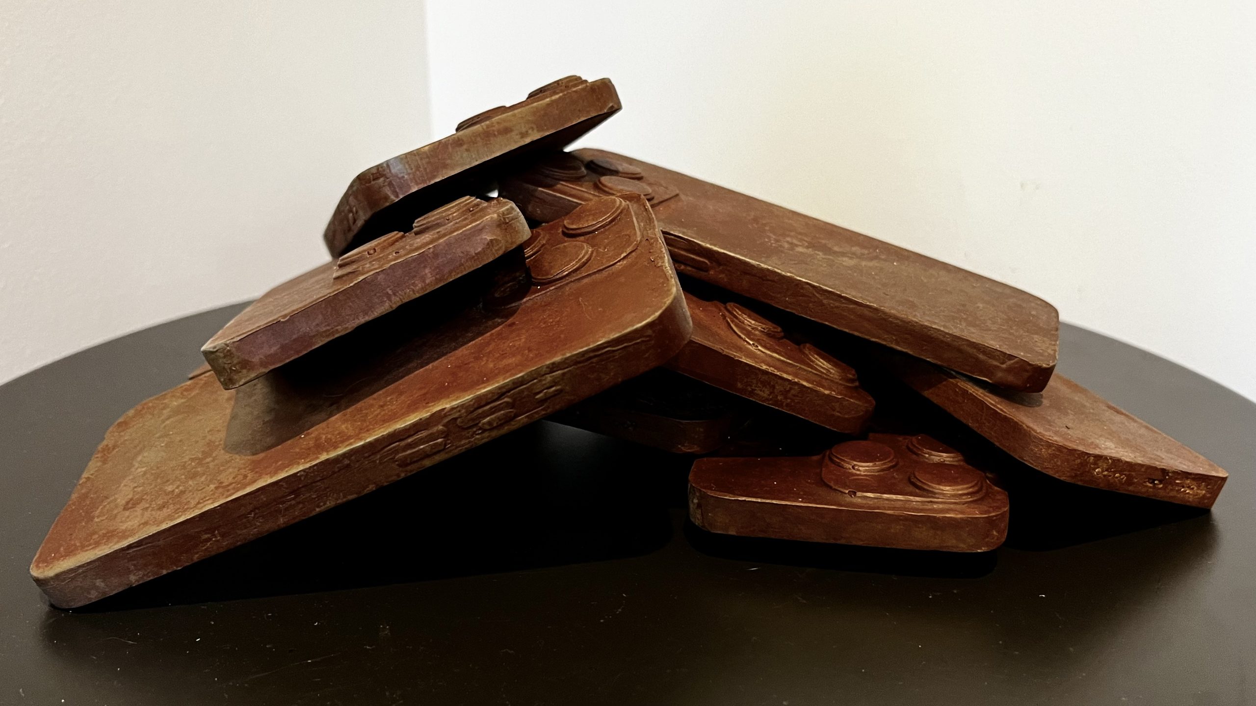
2024
9″ x 11″ x 4″
Bronze
Discarded phones piling up waiting for the apocalypse.


Three more pieces in my Melting Point series. See the first in the series for a more detailed writeup.
Melting Point #2, 2024
Bronze, 8″ x 6″

Melting Point #3, 2024
Bronze, 8″ x 6″

Melting Point #4, 2024
Bronze, 8″ x 7″

Melting Point #5, 2024
Bronze, 8″ x 12″


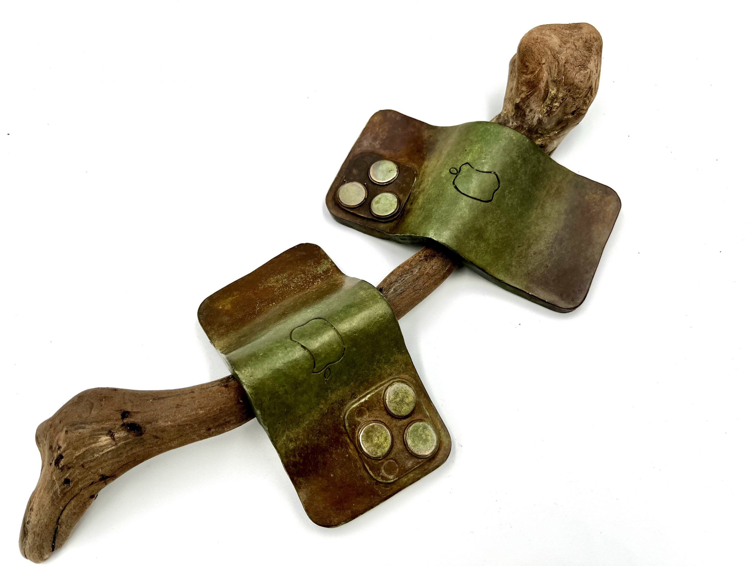
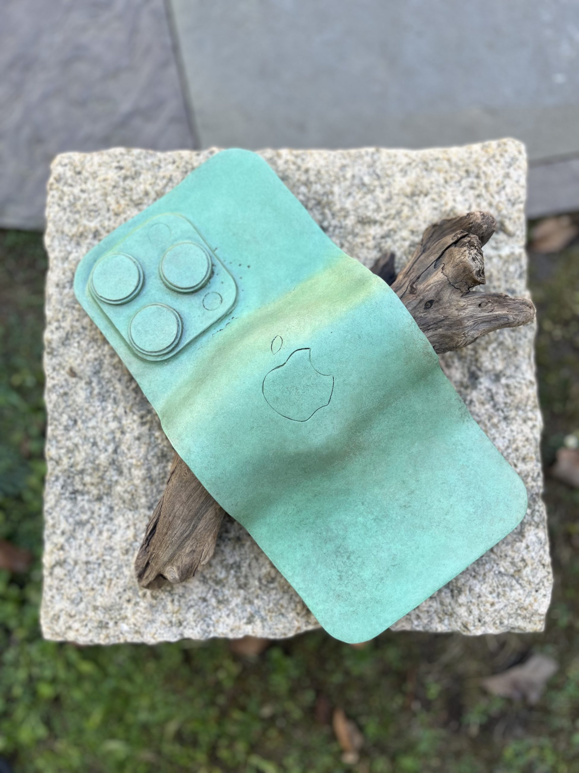
2024
15″ x 16″ x 3.5″
Bronze, driftwood
The second in a series that touches on the conflict between nature and technology as the technology that dominates our everyday lives suffocates, distorts, and intrudes upon our relationship with the natural world.


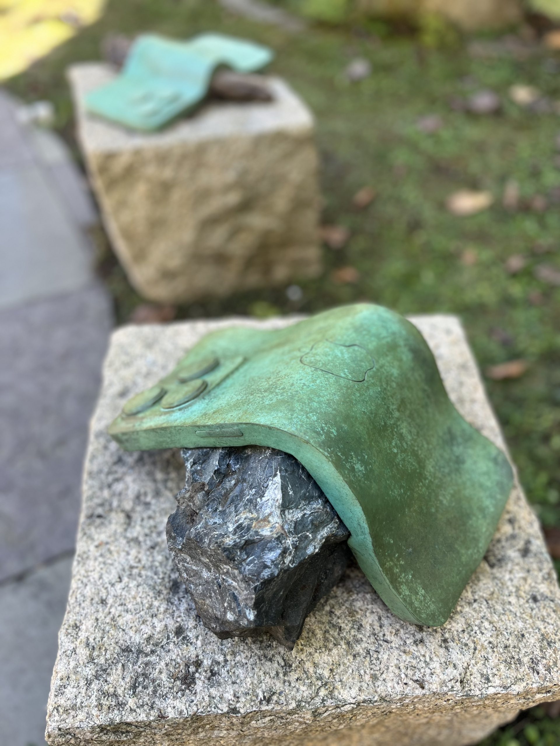
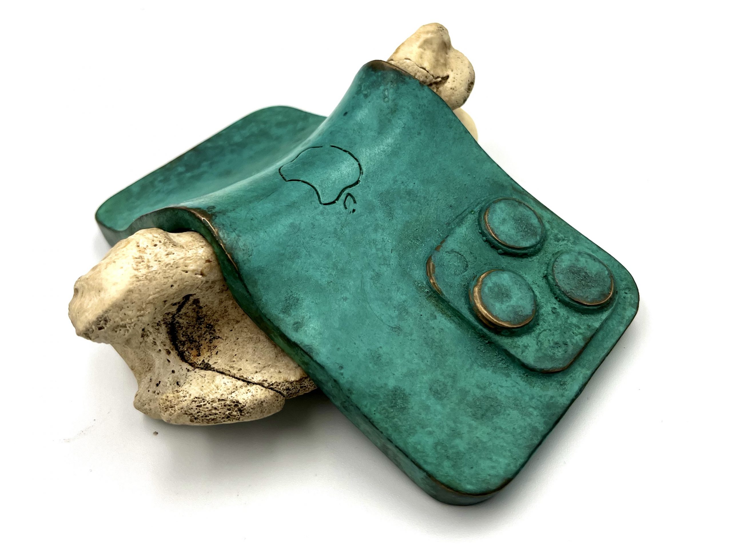
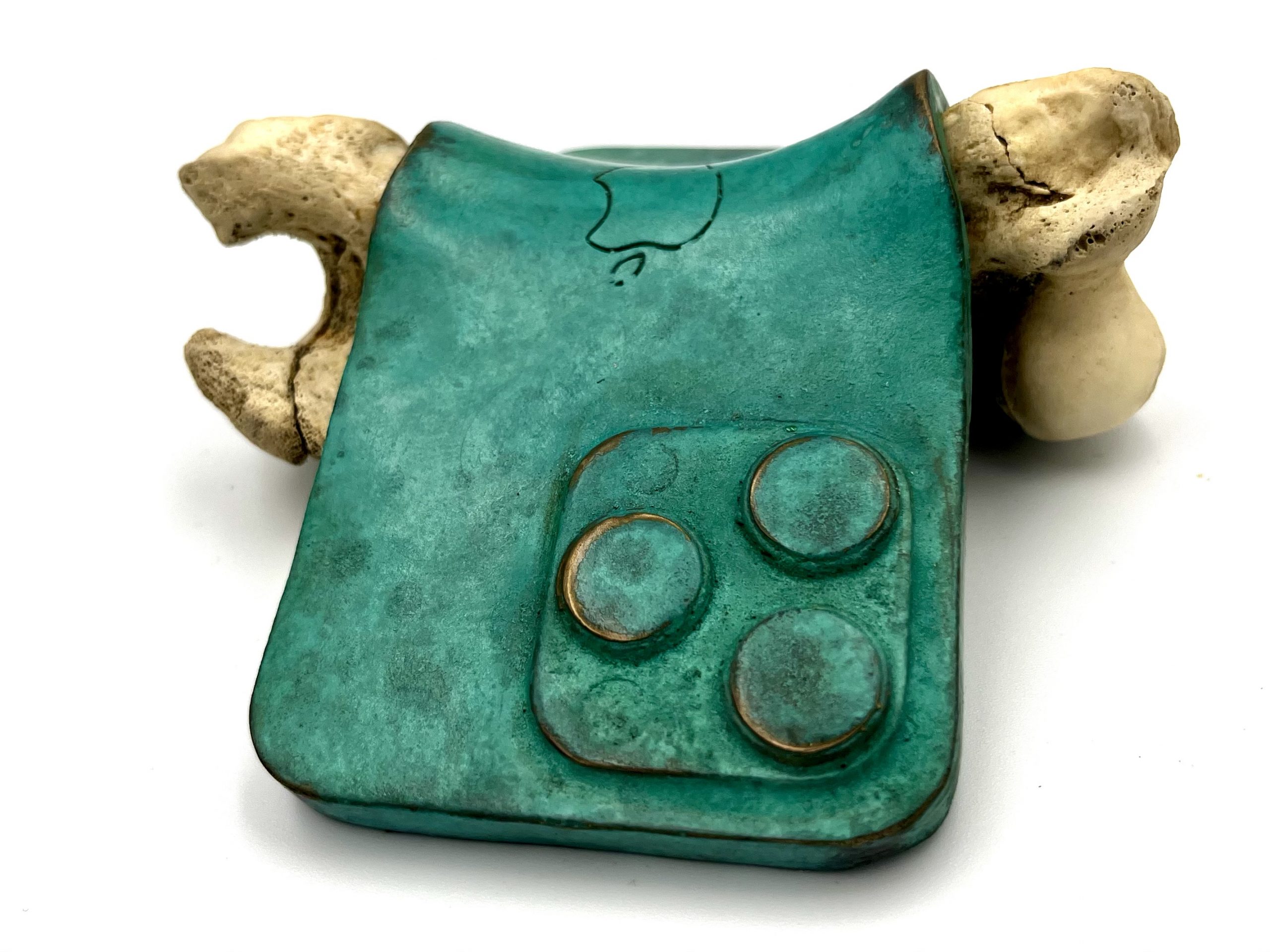
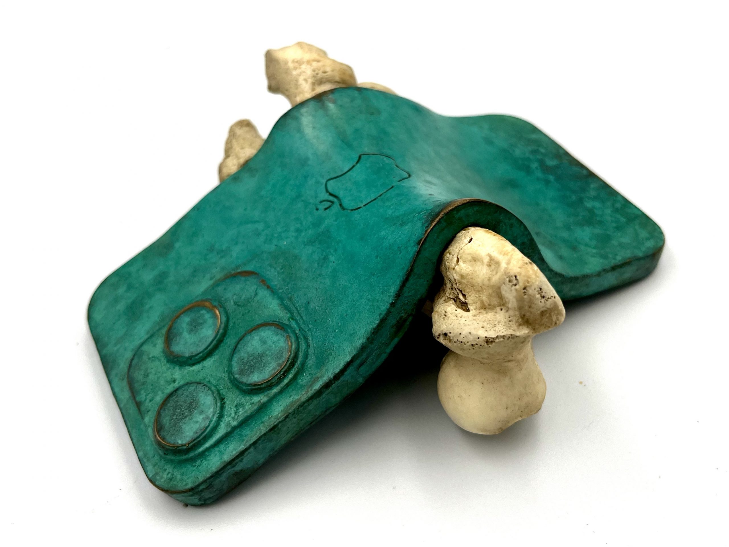
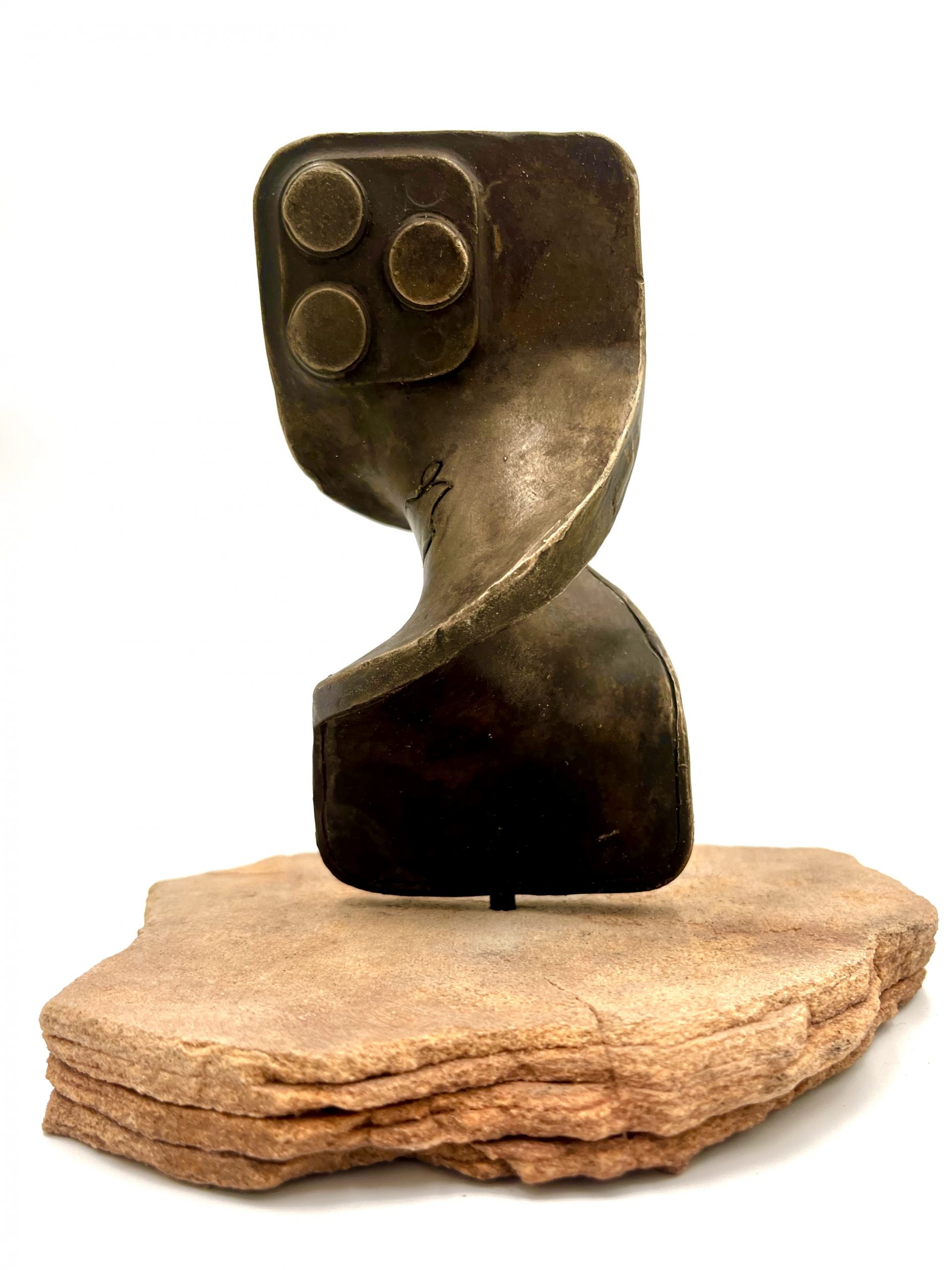
2024
14″ x 14″ x 6″
Bronze, stone
This piece touches on the conflict between nature and technology as the technology that dominates our everyday lives suffocates, distorts, and intrudes upon our relationship with the natural world.