20253″ x 1″ x 2″Bronze
202520″ x 14″ x 48″Bronze and steel chain
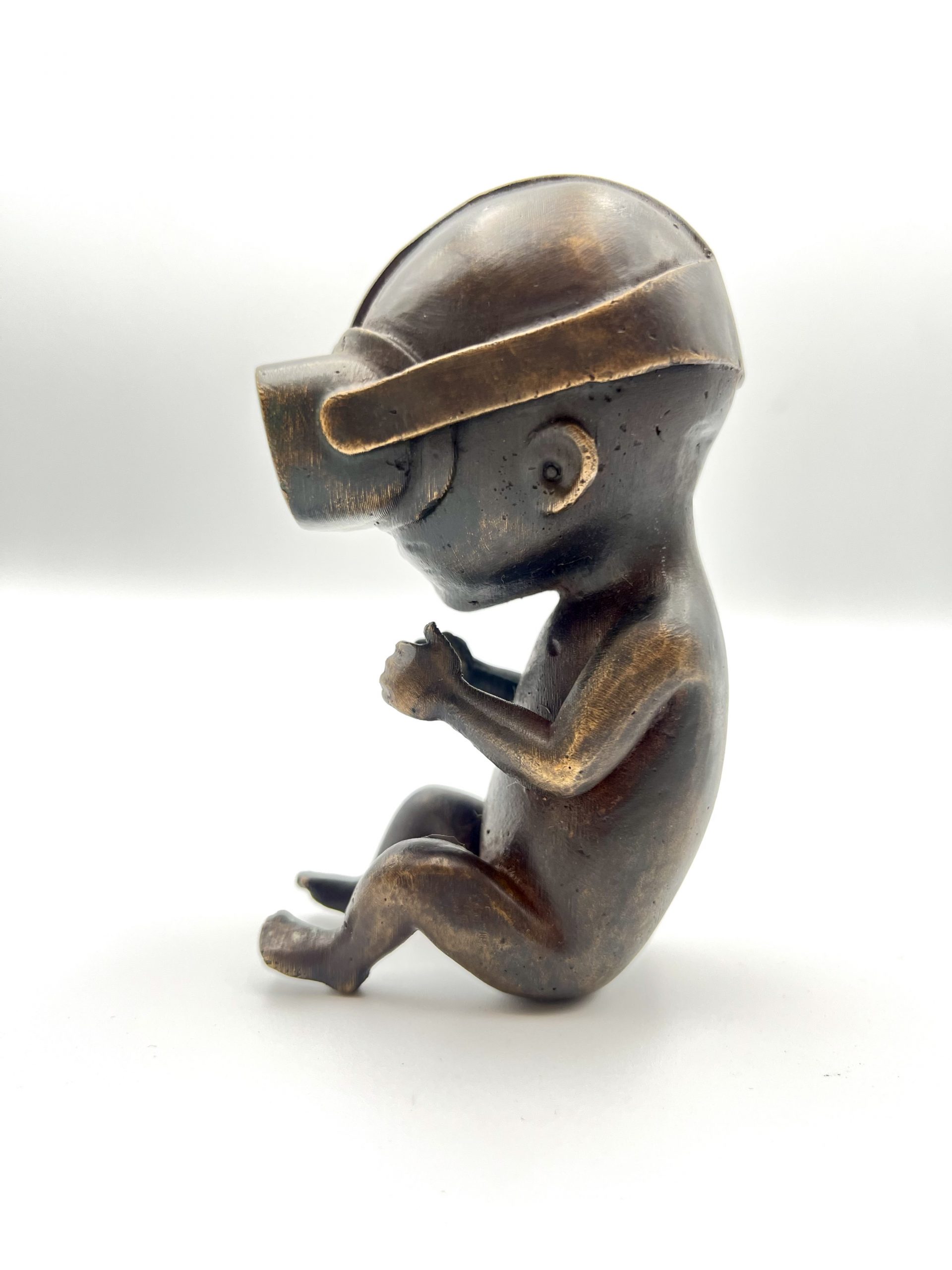
202512″ x 4″ x 12″Bronze
2025Bronze
20254″ x 2″ x 2″Bronze
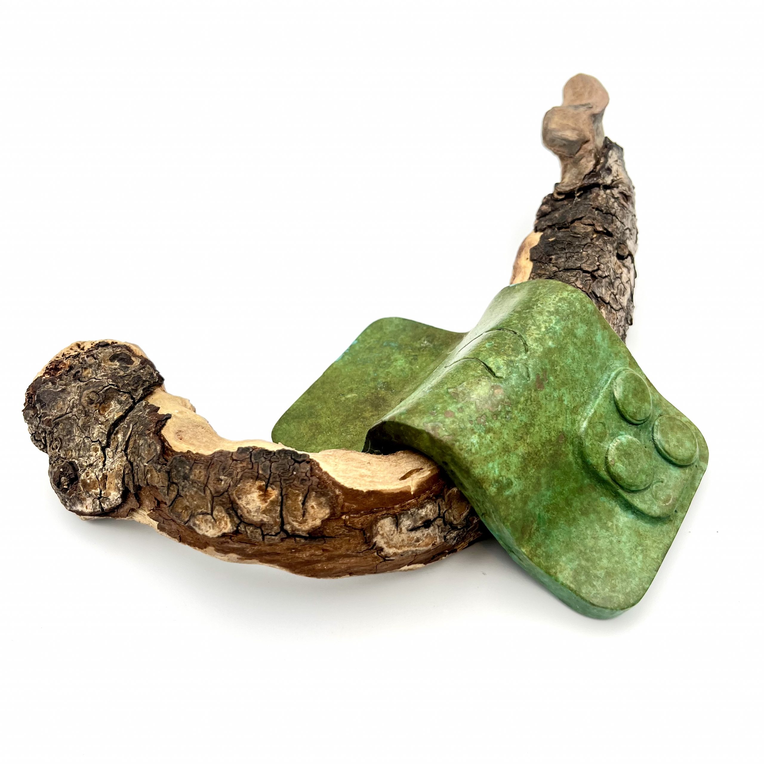
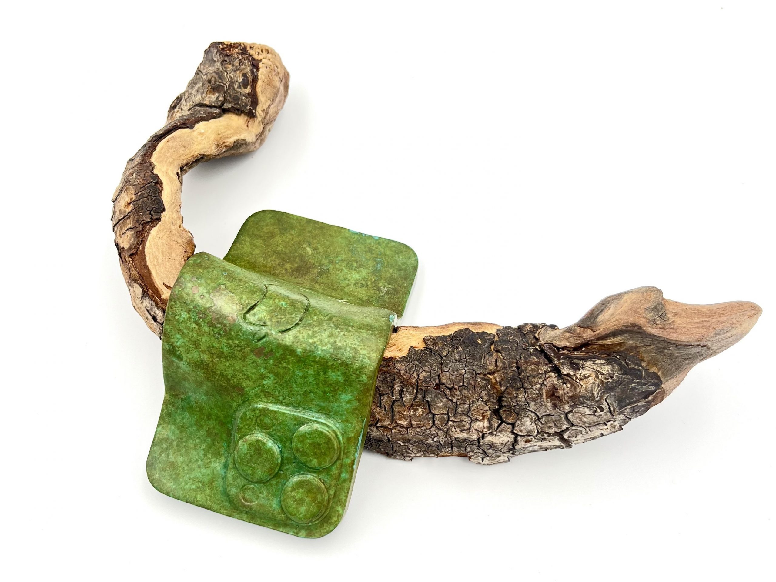
202510″ x 7″ x 3″Bronze and wood
20259″ x 5″ x 2″Bronze and bone
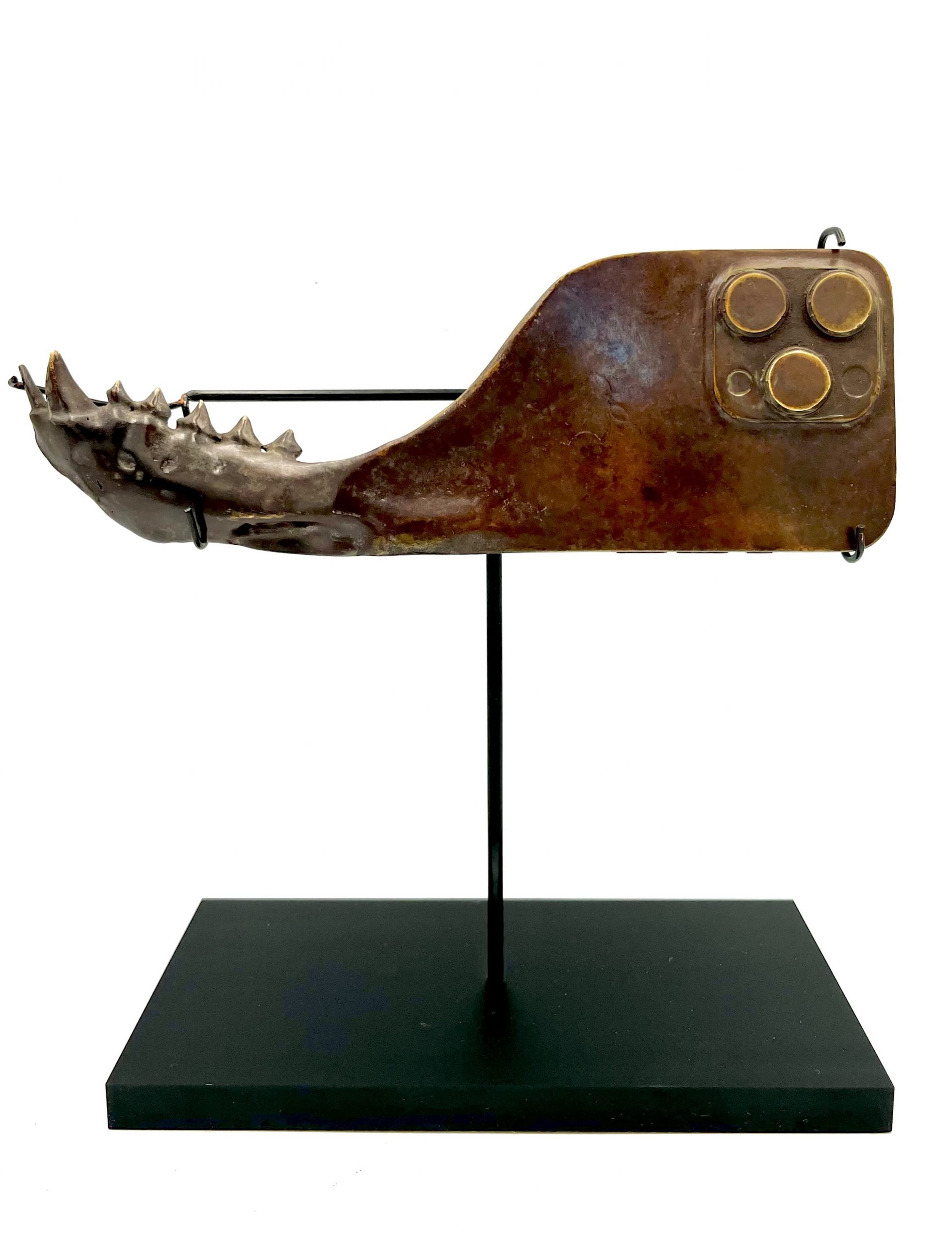
20258″ x 6″ x 4″Bronze and stone
20258″ x 4″ x 1″Bronze
20256″ x 3″ x 4″Bronze