
This data sculpture depicts a map of housing prices in San Francisco. It’s a map of the city, torn at the seams. The height of each area represents the average price per square foot for recent home sales. Where neighboring areas are close in value they are connected, but if neighboring areas are too far from each other I allow them to split, tearing the city along its most severe economic divides.


Data from Redfin
The data is records of approximately 5,000 recent home sales, downloaded from Redfin. The dataset itself can be downloaded here. The map below shows each sale color coded by the price per square foot.

I binned the data into hexagons and calculated the average price per square foot for each hexagon region. The map below shows these hexagons colored by and labeled with the price per square foot values for each region. You can start seeing the various relative differences between areas of the city. The lowest prices are in Bayview/Hunters Point in the southeast quadrant of the city, and then prices increase as you move northwest, and then the general trend is that things get more expensive as you get closer to the Marina, Embarcadero, and all areas generally along the northeast. You also see the little island of Noe Valley and the areas around Twin Peaks stand out as more expensive than their neighbors.

The data was then turned into a 3D model using a slightly modified version of shp2stl. I defined a threshold for how close together neighboring regions need to be to be connected, and any neighboring regions that exceed that delta are allowed to split from each other. That organically produced the spiral pattern through the city.


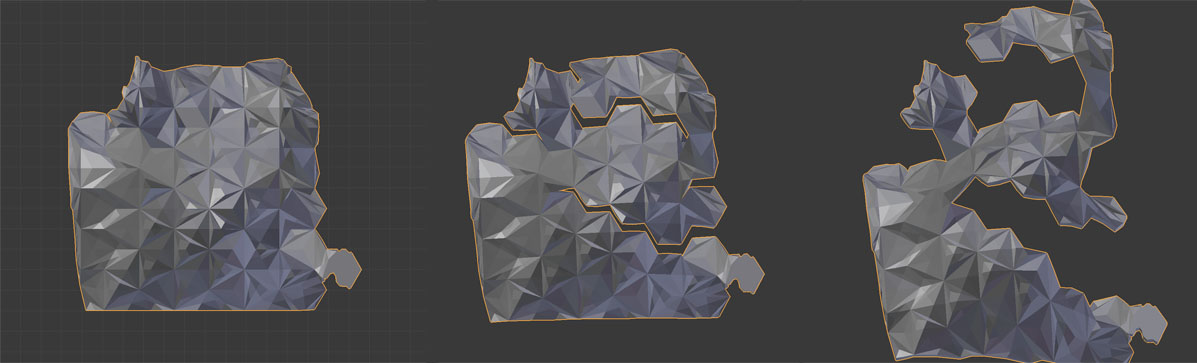
If you could take a photo from far enough away from straight above you’d see all the pieces line up to form the cohesive outline of the city. Since I don’t have a ladder that tall (or zoom lens that powerful), here are a few images of the model from straight above then rotating to see the breaks start appearing.
Printing
The model was then printed on a 3D printer (Type A Machines Series 1). It measures approximately 12″ high and took 36 hours to print. The vertical line structure you see below is the support material required for printing that was then removed.


The Stand
Once I had the sculpture I had to solve the problem of how to keep it from falling over. I ended up printing a base that used the the mesh of the bottom of the sculpture model to form the top of the base. The sculpture fits snugly on top of the base.


Print Your Own
You can download the raw data, the 3D model of the main sculpture, or the 3D model for the stand. Feel free to print your own, or remix the model in any way you like. All images and models are licensed under CC-BY.
This is stunning! Absolutely beautyfull!
Beautiful and informative (won’t be moving there!). The base is a good solution and looks fine.
Very interesting. Can you please post a direct-overhead photo so we can see the outline of the city?
Chris, I’ll try to update the post with these photos, but here are some shots that start looking at the model directly overhead and then rotate down: http://imgur.com/a/b4SGy
The post has been updated with a top-down view of the model. I can’t take a good photo with a camera from far enough away to get around the perspective issues.
This is absolutely incredible. Incredibly powerful piece.
This is very nice. Now I’m all enthused to make my forays into 3d printing.
Would you share the shape file and how you produce a shape file?
Kind Regards
It would be more interesting if there were models of other big cities to compare it to.
Could you print an overhead photo of the city onto it? Or at least a few landmarks? It is a map. I’ve never seen someone make a map and then omit any and all landmarks.
This is incredible. Thank you!
This guy should get a medal for calling attention to the crazy situation down there in the Bay. Anyone who lives there should show up at town meetings and hand these things out.