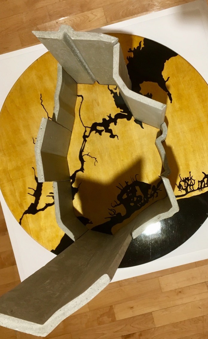
Art, Maps, Portfolio

Camp Fire Progression

Iron, bronze, 2022

This iron and bronze sculpture maps the movement of the Camp Fire that destroyed the town of Paradise, California in November 2018. It’s a map of the fire perimeter, with the majority of the sculpture in rusted iron. The boundary of the town of Paradise is in polished bronze inlaid into the larger sculpture.

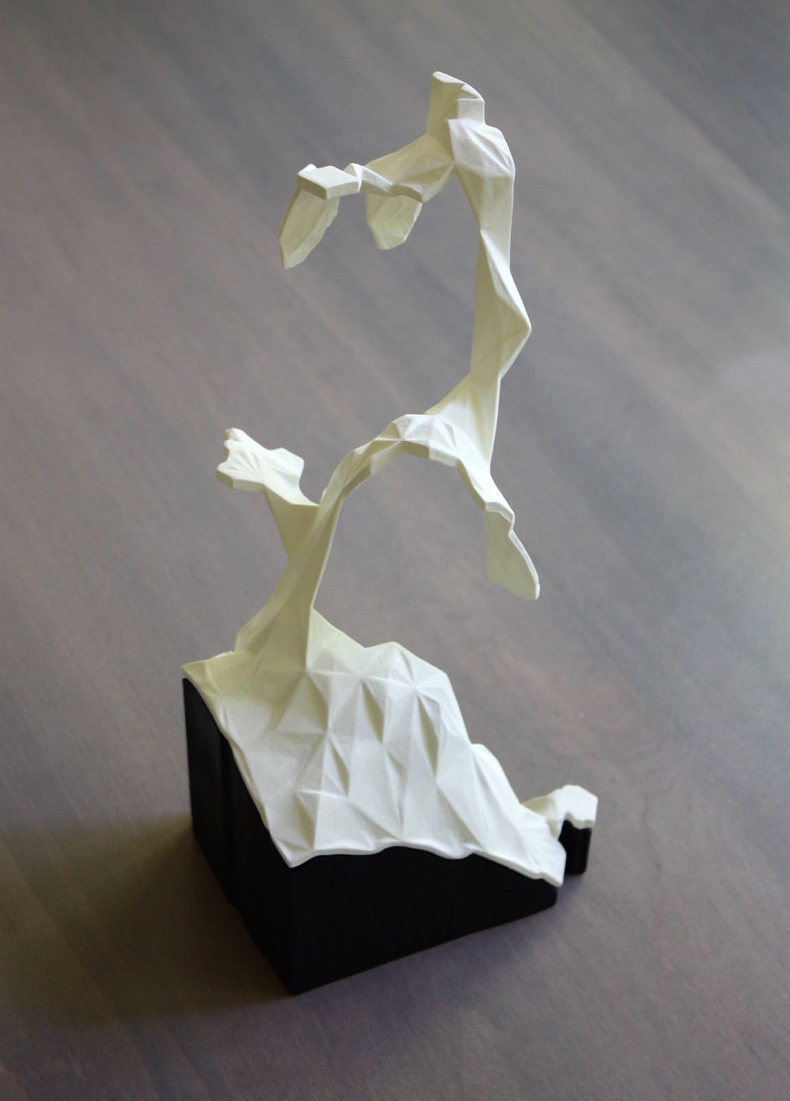
The height of the sculpture represents the time at which that area burned. The lowest parts represent where the fire started. You can trace the movement of the fire by following the sculpture from the low areas to the higher areas. The Camp Fire started near the middle of the fire footprint, just east of the town of Paradise, CA.

The Impact of the Camp Fire

The Camp Fire began November 8, 2018 and was fully contained on November 25, 2018. 85 people lost their lives. It destroyed over 18,000 structures, many of them in the town of Paradise, CA. This sculpture highlights the town of Paradise, however, it’s important to note that other towns, such as Concow, Magalia, and Butte Creek Canyon were also largely destroyed. It is the deadliest and most destructive wildfire in California’s history.

The Data

The source data was downloaded from NASA FIRMS (Fire Information for Resource Management System). The dataset consists of points with timestamps indicating when burn activity was detected.

You can watch an animation of the fire progression to get a sense of how the fire spread and what the sculpture represents:

Or here’s another animated map of the same data, color coding the burned areas by day:

The Process

I wrote code that converted that raw point data into a 3D model. That model was 3D printed, then I made a mold of the printed sculpture and cast it to wax. Then I used the lost wax casting method to create the iron sculpture and the separate bronze section. Metal casting was done at the Crucible in Oakland, CA.

Standard
Art, Maps, Portfolio

Walled NYC

Concrete, plywood, enamel, and paint, 2017 

Much of the rhetoric around immigration to the U.S. in recent years has centered on the Trump administration’s proposal to build a wall along the southern border. The effects of this debate on immigrant cities that are far from such physical borders is less visible, but in New York City, whose airports offer the first port of entry for many immigrants, the impacts of immigration policy are no less meaningful. In this sculpture, data artist Doug McCune physicalizes the barriers that many would-be immigrants face: a combination of restrictive policies, anti-immigrant sentiment, and economic realities.  

The work shows a concrete wall surrounding New York City. The height of each section is proportional to the number of immigrants living in New York who originally came from the various directions on the globe. The routes were mapped as an airplane would fly from each region of New York City to the country of origin. McCune determined the height by calculating the number of immigrants “crossing” each section of the city border. This piece challenges us to ask: what would New York be without immigrants? How close will we get to finding out?  

Source: The map uses data on country of origin for all foreign-born residents from the 2017 American Community Survey five-year estimates. 

This work was commissioned for the You Are Here NYC exhibit at the Pratt Manhattan Gallery, Sep – Nov, 2017.

Standard
Art, Maps, Portfolio

HayWired Shake Map

Bronze sculpture of a hypothetical magnitude 7 earthquake along the Hayward fault in the Bay Area. The data for this sculpture is from the USGS’s HayWired Scenario, which predicts what a large earthquake might do to the Bay Area.

The height of the sculpture represents the shake intensity at that point, reminding us how fragile our stability really is.

Standard
Art, Maps, Portfolio

San Francisco Housing Prices – Large Format

Large version of my sculpture of San Francisco housing prices.

This data sculpture depicts a map of housing prices in San Francisco. It’s a map of the city, torn at the seams. The height of each area represents the average price per square foot for recent home sales. Where neighboring areas are close in value they are connected, but if neighboring areas are too far from each other I allow them to split, tearing the city along its most severe economic divides. Data from 2016.

For more details see this writeup.

The large concrete base serves as a legend. The base is in chunks, with each chunk representing $100 per square foot. That allows you to see that the lowest-priced neighborhoods (data from 2016) start at about $500 per square foot.

Standard
Art, Maps, Portfolio

Weaponized Counties – 2016 US Election Sculpture

This pair of sculptures divides US counties into two sets: those in which Donald Trump won a majority of the 2016 US presidential election votes and those in which Hillary Clinton won a majority. Clinton assembled powerful urban centers to build her political base, with solid margins in most dense cities. Donald Trump, on the other hand, amassed a vast rural expanse of the less populated counties in the country. These counties were weaponized in the fight for the presidency, and this narrative of urban vs rural is visualized here in sharp, violent imagery, meant to evoke futuristic weapons turned on each other.

The counties are represented as their geographic shapes, with a thickness representing the number of votes the majority candidate received in each county. Counties are arranged along an x-axis from left to right, symbolizing the percentage of the county that voted for the left (Clinton) vs the right (Trump). The counties are rotated at random, melding with one another into a cutting, dangerous form. By comparing this visualization technique across both candidates we can see a stark difference in the makeup of the electorate.

Clinton Majority Counties

Trump Majority Counties

Continue reading

Standard
Art, Maps, Portfolio

Bridged Counties – 2016 US Election Sculpture

This sculpture takes the US counties and plots them left to right based on how polarized the votes were for one candidate or another in the 2016 US presidential election. Clinton landslide counties to the left, Trump landslide counties to the right. Then the counties are stacked one on the other to build up each candidate’s most polarized base. The height of each county is the # of votes for the candidate that won the majority of the county. These are the safe divided pillars on which each candidate builds their campaign. The two pillars meet in the middle, where the counties had an approximately equal split between the two parties.

Continue reading

Standard
Art, Maps, Portfolio

Sculpture of Housing Prices Ripping San Francisco Apart

This data sculpture depicts a map of housing prices in San Francisco. It’s a map of the city, torn at the seams. The height of each area represents the average price per square foot for recent home sales. Where neighboring areas are close in value they are connected, but if neighboring areas are too far from each other I allow them to split, tearing the city along its most severe economic divides.

IMG_9454
Continue reading

Standard
Art, Maps, Presentations

Desperately Trying to Remove the Air Quotes Around the Word “Artist”

On April 25 I had the honor of presenting at 360|intersect. My talk was titled Desperately Trying to Remove the Air Quotes Around the Word “Artist”. I present artwork I’ve created over the past year, and reflect on my struggle to identify as an artist.

The video recording of my talk is below, it’s about 45 minutes long.

Continue reading for slides and transcript

Standard
Art, Deviant Cartography, Maps, Portfolio

Discard the Poor

Census tracts are ranked by median family income and the poorest areas are cut out of the city and discarded. San Francisco is quickly becoming one of the most expensive cities in the world, but real world gentrification will take decades to fully push out all the poor people. With this map we do so in a single fell swoop.

Laser cut wood

discard_the_poor1

discard_the_poor2

Standard
Art, Deviant Cartography, Maps, Portfolio

Stalagmite Crime

Three panels present different views of crime in San Francisco: narcotics, prostitution, and vehicle theft. The height of each map shows the relative density of each type of crime, as if crime were elevation. The mountain peaks are exaggerated, jutting out into the viewer’s face.

Drug arrests occur throughout the city, but are heavily concentrated in the Tenderloin and Mission neighborhoods. Prostitution shows a stark contrast, with nearly all arrest occurring along only a few streets. And vehicle theft occurs heavily throughout nearly the entire city, highlighting that you can get your car stolen nearly anywhere you park.

3D printed plastic mounted on painted plywood
12″ x 12″ x 8″

all_three_front

all_three_angle

Narcotics

Narcotics

Vehicle Theft

Vehicle Theft

Prostitution

Prostitution

Standard