I’m working on a visualization of people logging into SpatialKey, and I’ve come up with the following table/chart.

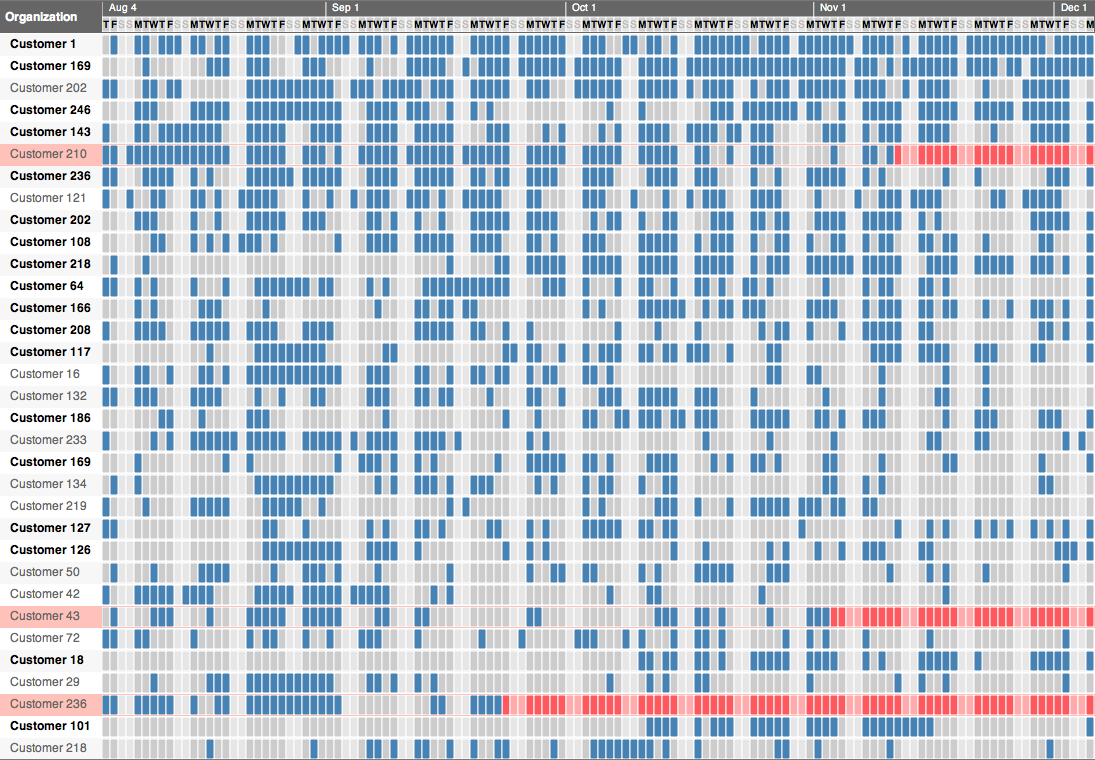
Each row represents one customer, and each cell is one day. If the cell is blue that means the customer logged in that day. Otherwise the cell is gray (lighter gray for weekends to give some context to the timeline). So cells are either on or off, I’m not trying to show how much usage there was on a particular day, just that there was some usage.
The only other thing beyond the on/off blue/gray state is I’m trying to highlight customers who have stopped logging in. So if a customer has previously been logging in regularly and then they stop for a long time, I highlight the row in red to show how long it’s been since we last saw the customer.
What kind of chart is this? There’s got to be a name, but I don’t know even know what to google to figure it out. I’ve created these before in Excel using conditional formatting of cell background color. This one is being created with d3.js using SVG (more posts on d3 will likely be coming).
The first thing I was reminded of was DNA sequencing using gel electrophoresis.

It also reminded me of the great Lite Brite that I used to play with as a kid.

So I’m currently going back and forth between “DNA Sequence chart” and “Lite Brite chart”, but there’s got to be a better term…
OK, just brainstorming from me … but, perhaps it’ll help!
CR (Customer Relationship) Health Chart … how close are our customers to “red lining”?
Looks like a disk drive that needs to be defragmented. So, maybe something like a Customer Defrag chart.
Maybe something about customer mindshare (If they login each day, they’re thinking about you). Similarly, “customer engagement”.
Maybe something about how “solid” a customer is (lots of logins look like a solid blue line … etc.)
Maybe something about Binary Customers (ok,maybe that’s too geeky!)
Maybe something about how fast customers are lost (lots of logins at first, then slowly fade away). Or, hey, maybe they start slow and pick-up steam, too! Hey, maybe it’s about customer momentum.
Binary matrix chart/plot?
I think you’re looking to name the chart and not jus this use of it right? Technically I think it’s a bitmap or bit array: http://en.wikipedia.org/wiki/Bit_array but that can be confusing since people already think of bitmap as a type of image.
As a chart it reminds me of a punch card so I would probably name it that.
@Paul – yeah, looking for the generic name of this type of chart. So yeah, the on/off or binary or bit nature of it is certainly one part. Each row is almost like a “binary timeline”.
I found a similar chart about fish in the Bahamas: http://backbreakercharters.com/fishing-chart/
Remind me of IBM Punch Cards.
https://www.google.com/search?q=ibm+punch+cards&hl=en&prmd=imvns&tbm=isch&tbo=u&source=univ&sa=X&ei=pJHdTr6HGKaOiALinbHVCA&ved=0CEkQsAQ&biw=1680&bih=938#hl=en&tbm=isch&sa=1&q=ibm+punch+cards&pbx=1&oq=ibm+punch+cards&aq=f&aqi=&aql=&gs_sm=e&gs_upl=0l0l0l61873l0l0l0l0l0l0l0l0ll0l0&bav=on.2,or.r_gc.r_pw.r_cp.,cf.osb&fp=745c79fda7476784&biw=1680&bih=938
Given that they were later used as time cards, seems rather fitting:
http://www.californiatabcard.com/images/Punched_Interpreted_Cards_2.jpg
(from this company: http://www.californiatabcard.com/Tab_Cards.html )
Hanging chad chart.
@Dusty – the punch card (especially when actually used as a timesheet) is great, that really matches the visual style of the chart. I may even make one that copies the look of the punch card more exactly. Good find.
If you are going with the punch card, then how about the ‘Hanging Chad’ chart. 😉
And again, you could always name it after yourself. There are Gantt charts, how about the McCune Chart.
On a more serious note, it kind of reminds me of a SAT score card that you would fill in the ovals. In this case it’s rectangles. Probably not the best analogy, but its the first original thought I could think of.
Maybe something simple like Usage Timeline.
“Punch Chart” or “Scan Chart”
I totally agree with the punch card thing. Also, remember the Scantron tests we use to take in High School?
To me that looks immediately like the images used in Spectroscopy. This image provides an example of what I’m talking about. You have a unified “whole” which is the total spectrum, at the top (ie, this is what it would look like if a given row satisfied every column) and then your actual rows provide an at-a-glance mechanism for displaying which subset of the whole that row represents.
http://www2.ifa.hawaii.edu/newsletters/images/37spectra.jpg
So with that in mind I’d humbly propose naming it a spectral graph or a spectroscopic graph, perhaps? Because you really are fundamentally plotting values against a spectrum, in a way. Anyway, my two cents.
Google Image search for “punch card graph” as mentioned by the others brings up similar viz to yours. Think its an appropiate and intuitive name!
So rad Doug!!
You’ve created a heat map (http://en.wikipedia.org/wiki/Heat_map). These are used frequently to visualize gene expression data.
DNA chart.
How about Linear bit table? Or binary map sequence. Some more for fun, numerical cross column table chart, scalar binary matrix, linear bit blocks table, quantum scalar oscillation matrix transformation line. Who could dispute a name like that? 😛