

Images courtesy of the Image Science & Analysis Laboratory, NASA Johnson Space Center
As I was flying back home into San Francisco airport I was watching the city lights out the window and got struck by a bit of inspiration. I find cities beautiful, from the graffiti to the neon signs to the line of headlights on the highway. A city viewed from above at night is captivating. I wanted to try to recreate that same look, but by visualizing data (in one sense you can say that the real view of a city from above is already a visualization of population data).
I started searching for images of cities at night, and found these amazing images from NASA. All those images were taken from a space shuttle orbiting the earth. These images tell you a lot about the city, the layout, urban density, planning (or lack thereof). I wanted to take other meaningful data and create similar images.
All the visualizations below have been created with SpatialKey. However, this is some experimental work I’ve been playing with to generate the “night light” images, so it’s not released (and might not ever be). Basically this is a peak behind some of the R&D work I do for fun (yes, for a dataviz dork like me making fake “cities at night” images is my idea of fun).
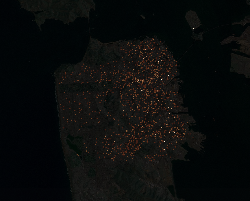
Crime in San Francisco
This image is all crime in San Francisco for a 3-month period. You can see some of the same features that you can see in the NASA space image, such as Golgen Gate Park and the Presidio (the area on the north-west edge of the city). All in all it’s interesting how similar the crime image looks compared to the NASA image. Downtown is the brightest spot in both images, which means that it’s literally the brightest area of the city (the most streetlights), and also has the most crime.

And here are breakdowns for a few different crime types. Notice how different the distributions are. Narcotics crimes are heavily clustered and can be found downtown (in the Tenderloin), in the Mission (near the 16th St BART station), and along Haight Street near Golden Gate Park. Whereas vehicle theft is scattered fairly evenly throughout the city.


Graffiti Reports in San Francisco and New York
Both San Francisco and New York publish their 311 data, which is when citizens call for city services. One category of 311 calls is to report graffiti. Graffiti is interesting in that it often follows specific city streets. When we look at the graffiti data for both cities we see specific streets that have far more graffiti than others. I love these images (particularly the one of SF) because they really look like a view of street lights from a plane.


Trees planted in San Francisco
Another one of my favorites of this set is data for all the trees that the city of San Francisco has planted since 1990 (all this SF data is available at datasf.org). You can see the heavy planting along Market St (which cuts diagonally through downtown), as well as along streets like Sunset Blvd (the street running north/south on the western side of the city).

Street lights (or SF as a giant lite-brite)
One final image of San Francisco we have is the locations of every street light in the city. I liked this image because it reminded me of playing with a Lite-Brite when I was a kid. It almost makes city planning feel light a grown-up version of playing with little plastic lights.

Doug,
Cool. I agree with you, this is fun stuff.
Pingback: Data Warehouse And Its Applications In Agriculture | TRANSNATIC.com
Pingback: Nicole Atkins – Neptune City | Cat Walk Diet
Pingback: If San Francisco Crime was Elevation | Doug McCune
BTW, this is visualization of DATA about crime, not crime itself. Sorry to be so pedantic, but you may want to qualify your descriptions to make them a little more accurate. I think that some neighborhoods may not have a culture of reporting crime or may not have enough law enforcement agency presence to accurately measure crime.
Pingback: davidrenz.com » Elevated crime (data)
I’m with Kari, but I’d go further, it’s visualizations of data of REPORTS of crimes, and/or arrests, not CRIME DATA. As I just posted over on the new (beautiful) “elevation” visualizations, the difference is HUGE. Glad Kari went into explaining some of the MANY reasons they are not the same thing. Thanks again,
Can you do this for San Jose, CA? Thanks either way.
Pingback: Warren Ellis » 3D Crime Maps
Pingback: Rossington Architecture
Pingback: Dynamic Diagrams : Information Design Watch : Information is Light
Pingback: datavisualisation.co.uk » If Crime were Elevation
Pingback: Urban Media Archaeology » Some maps and things like maps and movies about maps