
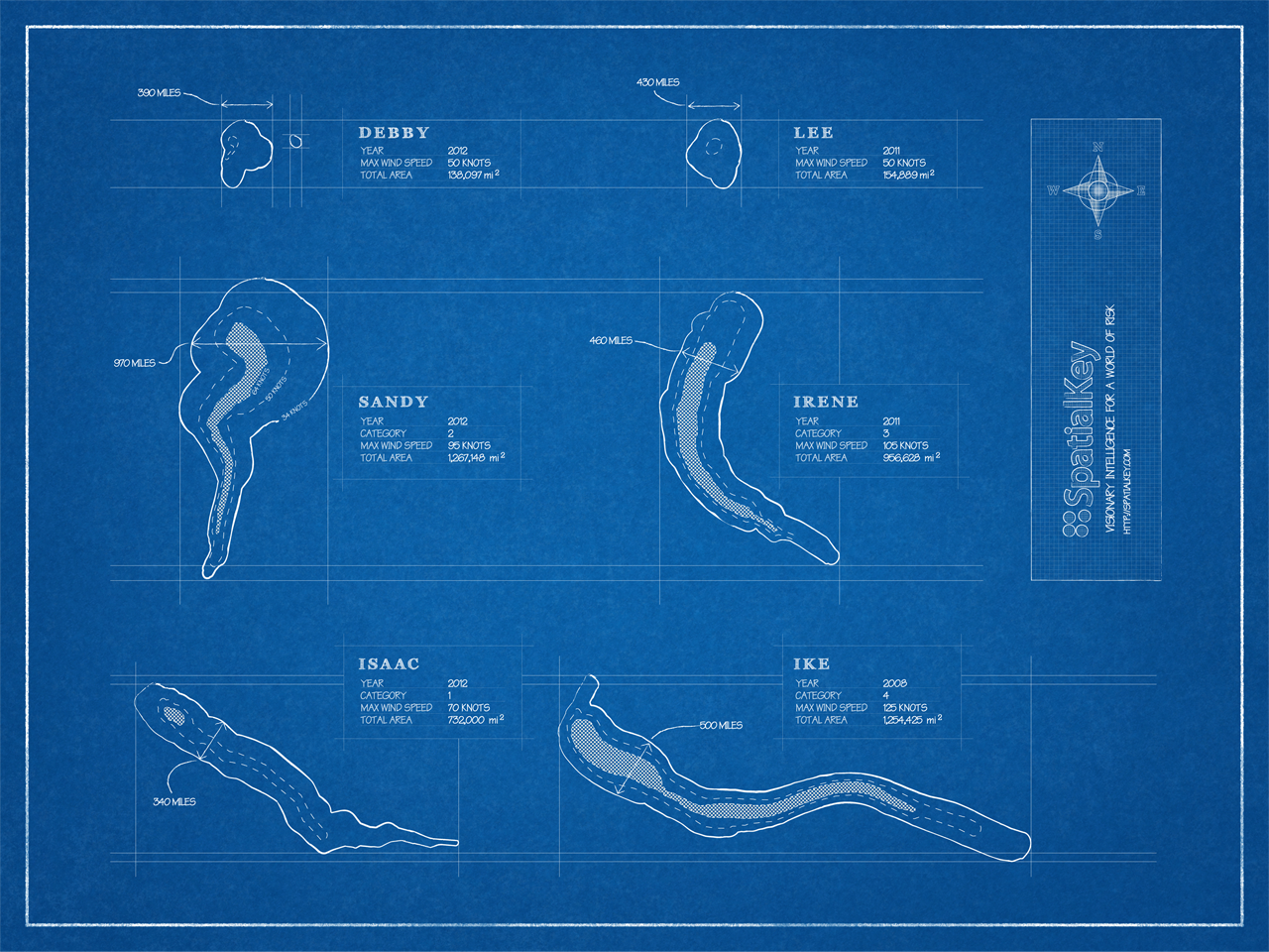
As we begin the 2013 hurricane season, I wanted to share something I created after last year’s monumental Superstorm Sandy. After the 2012 hurricane season I was trying to wrap my head around how large Sandy was and how that compared with prior storms. In particular, I wanted to understand how Sandy compared to 2011’s Hurricane Irene.
I thought a blueprint was the appropriate metaphor for comparing these storms. The windfields of the storms are mapped side by side so you can see how large the areas of severe winds were in each event.

Larger version | Even larger version
All the storms shown are drawn to scale and have their original orientations preserved (so north is up in all the storms). You can see that Sandy, at almost 1,000 miles wide, is nearly twice as wide the prior year’s Hurricane Irene.
To show more detail, here’s a closeup of Sandy:

And Hurricane Irene:

We ended up sending prints of these out to our SpatialKey customers who use our hurricane mapping software.
Credits
All storm data is directly from NOAA’s National Hurricane Center. The blueprint background is from psdGraphics.