One of the first time-series line charts ever drawn was a visualization of the great American credit crisis (but probably not the credit crisis that comes immediately to mind). If you were to look at this chart today you might even mistake it for the charts of the housing credit crisis of the past few years.

(see image credits below for image details)
This chart was created by William Playfair and published in 1786 in The Commercial and Political Atlas. In that work Playfair literally invented the line chart. This particular chart shows the imports and exports between Britain and America between 1700-1800. The red line is the line for exports from Britain to America, and the lighter yellow line is the imports from America. You can see the relationship of imports to exports stays relatively constant for the first 50 years (1700-1750) and then the exports start shooting up dramatically, at a rate much greater than the increase in imports.
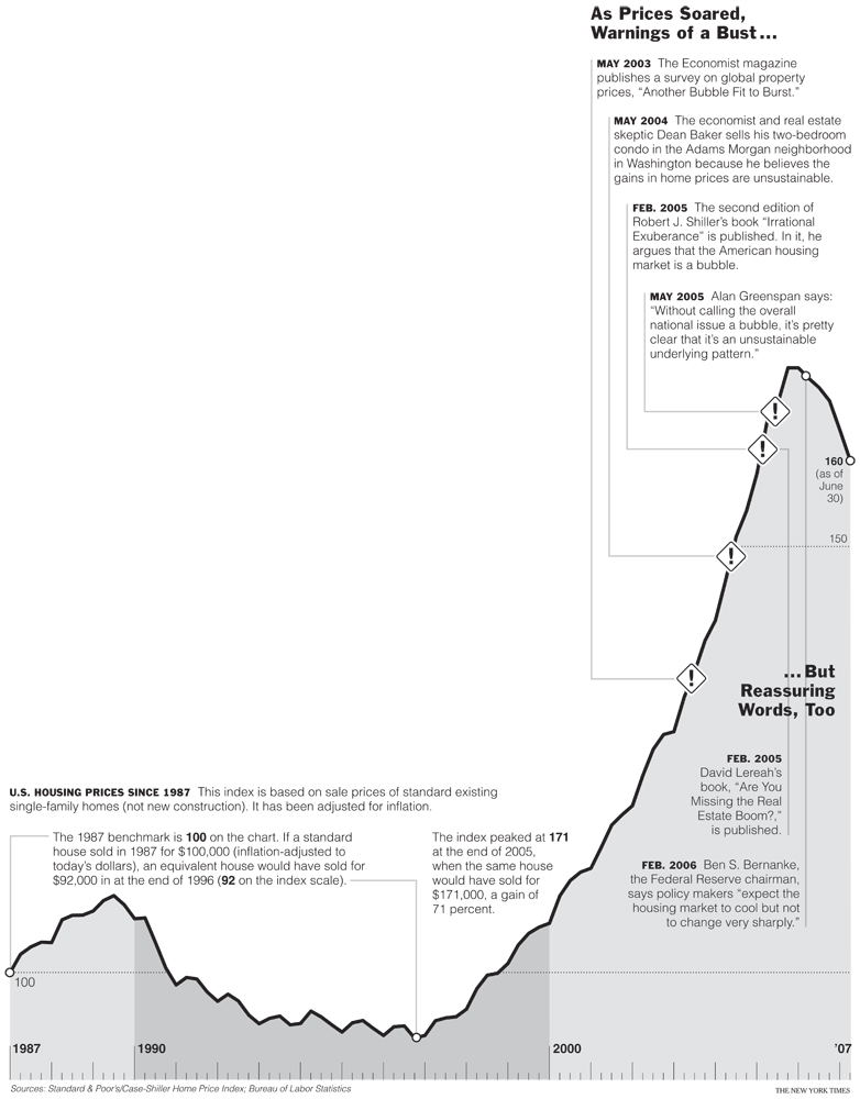
Compare that with this chart of housing prices, created by the New York Times.

(image from the New York Times)
I guess we know what a credit-driven catastrophe looks like. And it’s not only the image itself that looks similar, at times his words sound as if he’s writing today about our current financial mess.
Between 1750-1772 there was a rapid increase in exports from Britain to America. These exports were the result of many new merchants hoping to strike it big by shipping goods to the new settlers. But the reason things got out of control has to do with credit. Merchants started lending and borrowing on credit to finance their get-rich-quick schemes of selling stuff to America. Playfair writes (all emphasis added is mine),
Ever since the invention of paper credit, trade has had a latitude it did not before enjoy, and its progress being less natural, has become more intricate. That bound set and preserved by the nature of things was removed, when paper credit was first invented; previous to which, nothing represented wealth that was not wealth itself, or that was not physically worth the sum it represented; and in order to give credit in business, it was absolutely necessary either to possess, or to have borrowed capital.
And because of this new credit, people started making business decisions that were insane. They started shipping products to America before they knew they could sell them. Since the money was free they took irrational risks. And if your business venture failed miserably you could always just hide from your creditors in that new land of opportunity.
Of the eventual crash, Playfair writes,
For the first fifty years, we observe the simple and regular growth, from poverty to wealth, of a new country; during the succeeding twenty years, we are astonished at the extent and operation of a mad mercantile speculation carried on by our own country; and the period which succeeds, shews the catastrophe that so airy and so ill-founded a project was likely, sooner or later, to experience. There is not any branch of trade, which, from the nature of its progress, affords so much instruction as this. It merits equally the attention of the philosopher, the politician, and the merchant; for it throws light upon all the three different objects of their pursuits.
Isn’t that beautiful? Almost the same words could apply to the current financial crisis. And one final quote that I like, which also made me think of our current crisis:
Upon the manner in which business is conducted, depends something more than merely the gaining or losing a little money. The happiness of numbers of innocent individuals is frequently depending upon the success of projects, with the formation of which they had no concern. What numbers have been ruined, and how many more deprived of fortune, by our ill-conducted trade with America?
What numbers have been ruined indeed.
I’ve been reading the works of Playfair to understand the history of data visualization (in this same work he also invented the bar chart, and in a successive work he invented the pie chart). I wanted to make sure I understood the history of statistical charts, since as they say, those who cannot remember the past are condemned to repeat it. I didn’t realize that phrase would also apply so perfectly to the text accompanying the images.
The first image above is from William Playfair’s Commercial and Political Atlas, 3rd edition, published in 1801. The scan is of a copy contained in the University of Pennsylvania’s Annenberg Rare Book and Manuscript Library. It was reproduced in a publication by Cambridge University Press entitled The Commercial and Political Atlas and Statistical Breviary, published in 2005, which was compiled by Howard Wainer and Ian Spence (and if you want to be even more technical the image above is a reproduction from a Google scan of the Cambridge University scan). As was decided in Bridgeman vs Corel Corp (full text), a reproduction of a work of art in the public domain is not protected by copyright. As was stated in that verdict: “While it may be assumed that this required both skill and effort, there was no spark of originality — indeed, the point of the exercise was to reproduce the underlying works with absolute fidelity. Copyright is not available in these circumstances.” I am reproducing the image here with that legal precedent in mind, and with the best of intentions. I would highly recommend that if you are interested in Playfair’s work you buy the reprint by Cambridge University Press. It contains full-color reproductions of the charts, and the introduction contains great biographic information about Playfair.


