Art, Maps, Portfolio

Haiti Earthquake Tree Trunk Map

haiti_earthquake_full

This piece is a representation of the January 2010 earthquake that destroyed much of Haiti. Laser cut out of different kinds of bamboo, it shows the shake intensity data radiating out from the epicenter near Port-au-Prince.

This devastating earthquake caused massive damage and an unknown number of deaths. Estimates were anywhere from about 80,000 to 300,000 casualties. Even this many years later it’s hard to know the full impact of this event. I remember watching the news for the weeks after this earthquake as they tried to find the dead and survey the damage.

Continue reading

Standard
Data Visualization, Maps

Hurricane Blueprints

As we begin the 2013 hurricane season, I wanted to share something I created after last year’s monumental Superstorm Sandy. After the 2012 hurricane season I was trying to wrap my head around how large Sandy was and how that compared with prior storms. In particular, I wanted to understand how Sandy compared to 2011’s Hurricane Irene.

I thought a blueprint was the appropriate metaphor for comparing these storms. The windfields of the storms are mapped side by side so you can see how large the areas of severe winds were in each event.

hurricane_blueprint_1280

Continue reading

Standard
Art, Maps

Hurricane Coasters

I’ve been creating maps of hurricanes for the last few years. My job involves writing software to assess the impact of an approaching storm, so during an active hurricane season I become a bit obsessed. When you watch these things so closely and so constantly they get burned into your memory. They almost enter your subconscious. They become inkblots on a Rosharch test. Irene, Isaac, Sandy. I started seeing hurricanes everywhere.

hurricane_rorschach

I decided to create something that took these shapes that I was so familiar with. These shapes that were burned into my head. These shapes had become such a constant presence in my mind I figured it was only fitting to make them a constant presence in my home as well, so I created a set of coasters.

hurricane_coasters

Continue reading

Standard
Art, Data Visualization, Maps

Physical Maps – My 360|intersect Presentation

I recently had theĀ privilegeĀ  of presenting at 360|intersect in Seattle. My talk explored creating physical map using various techniques like 3D printing, laser cutting, etc. This was a much more artistic exploration than a lot of my previous work, and I am incredibly proud of the pieces I produced. The full video of my presentation is embedded below. I’ll be documenting each of the projects I created in future blog posts, but for now here’s the 45-minute long presenation:

And if you just want to see an overview of the various projects before watching the video, here’s a quick preview of all the projects that I talk about in the presentation:

360_intersect_projects

Standard
Art, Data Visualization, Maps

Printing Hurricanes as Gifts

We had a very busy month of August at SpatialKey as Hurricane Irene tore through the east coast. Our insurance customers were constantly watching Irene as it built up and approached land, then as it swept through parts of North Carolina, Vermont, New York, etc, and then as it died out quietly. We were writing software to visualize hurricane forecasts in real-time, as the storm was approaching, and getting immediate feedback from our customers. It was all a bit stressful, but exhilarating.

I wanted to have some kind of gift of thanks to give to our most helpful customers, who worked closely with us, helping us develop our hurricane product. To be honest, it felt like we all weathered a storm together during that hectic week in August. We brainstormed on sending out shirts, or bags, or some other standard corporate gear, but none of it really felt like “us”. So I came up with a more unique gift that I think captures our culture.

This is a 3D model of Hurricane Irene. The height of the model represents the wind speed at that location. You can see there are 3 bands of different wind speeds. The outer band represents where wind speeds hit 39 mph, the next band represents 58 mph, and the third band represents 74 mph (hurricane force winds). Then running through the middle we have the path of the eye of the storm, and the height of that track represents the exact speed at that point in time (Irene got up to 120 mph).

I created the model by taking the GIS data straight from NOAA and using that to build up the 3D model by hand. Then I sent the 3D model off to Shapeways for printing. The printed version you see in the photos is made out of alumide, which is sort of a composite aluminum material.

For our customers who were working with us while Irene passed through, we hope this will be a nice reminder of the work we did. It’s just a little paperweight to sit on your desk, but for those who were watching Irene as it developed and keeping a very close eye on the footprint of the storm, I think it’s a nice memento.

A hurricane can be a difficult concept to understand. For those affected in its path, it’s an incredibly tangible, visceral thing. But for those watching from afar (like me, sitting in California), it’s less “real”. We hear the overly-dramatic news reports and the doom-and-gloom predictions, but it’s a purely theoretical experience. Having a little paperweight of the storm on my desk doesn’t really help me understand the true impact Irene had on all those folks along the east coast, but at least I can touch it.

Standard
Maps, SpatialKey

Crime Maps on the Guardian Powered by SpatialKey

I’m happy to announce a new crime mapping application I’ve been working on that just went live on the Guardian DataBlog. The app lets you compare different cities in England to see where crimes of different types are distributed. You can either compare two cities side by side, or two different crime types in the same city. So if you’ve ever wondered which areas of London have high amounts of violent crime but low amounts of burglary, now you can find out.

This custom app was built upon SpatialKey, which made cranking it out only take a matter of days (the whole thing start to finish took about 4 days).

Standard
Art, Maps, SpatialKey

Night Vision Maps of the WikiLeaks Iraq Casualty Data


In 1990 I was an eight year-old kid. And like most eight year-olds I spent a lot of time in front of my TV. But the summer of 1990 was different. Instead of cartoons I was watching the first Gulf War.

The television media coverage of the war was everywhere. Except these weren’t the gruesome images of the Vietnam era. These were images that looked more like videogames. We had cameras attached to bombs that used night vision and targeting scopes as they dove into buildings. All the images were a bit fuzzy, a bit grainy, either tones of gray or green, and overall void of emotion.

But we were watching people die.

The disconnect between the emotionless images shown on TV and the reality that they represented has always stuck with me. The fact that we could (and still do) present something so horrible in such a clinical, disconnected way makes my head spin.

WikiLeaks Iraq data

I’ve been experimenting with mapping the recently released data from WIkileaks that documents deaths in Iraq. All told the data documents 108,365 deaths, which we assume are just a fraction of the true casualty count from this war. Of those deaths, 65,641 were civilians.

I’ve used SpatialKey to produce some heatmaps of these deaths by recreating the aesthetic of the night vision images we’ve grown so used to seeing. I downloaded the data from the compiled spreadsheet published by the Guardian. Each image has a high resolution version available (2,474 pixels by 1,419 pixels).

A view of the entire country


High resolution version

A closer look at the area of Baghdad


High resolution version

More details of Baghdad


High resolution version

Why?

These images are meant to be a bit provocative. Every tiny blurred dot represents someone dying. And yet it’s all presented in a way that everyone is comfortable with. When you glance at these images you don’t immediately think of killing. We’re so used to seeing emotionless, blurry images of rockets exploding and precision bombs targeting buildings that we disconnect the image from the reality. These are images of death. And the fact that we’re comfortable looking at them should give us pause.

Standard
Data Visualization, Maps, SpatialKey

Take the Tangent – Video of my 360|Flex Keynote

I was honored to be asked to give a keynote presentation at 360|Flex in DC last month. All the sessions were recorded, and John Wilker was gracious enough to let me post the full video of my keynote.

This keynote was a bit different. I went out on a limb a bit and talked about the experimental projects that I’ve been working on, and my belief in the importance of pursuing fun experiments to stay invigorated and passionate about our work. It covers a number of mapping and data visualization projects I’ve been playing with, but the point was really that we all need to pursue what we’re passionate about. For me that happens to be maps right now, but everyone has their own unique areas of interest.

If you’re interested in mapping work then the projects I talk about should be right up your alley. But even if you’re not a map geek, I think the presentation is still interesting and (I hope!) inspirational.

You can also see the slide deck on its own, but I think the video gives much better context to the slides.

Standard
Art, Data Visualization, Maps

If San Francisco Crime were Elevation

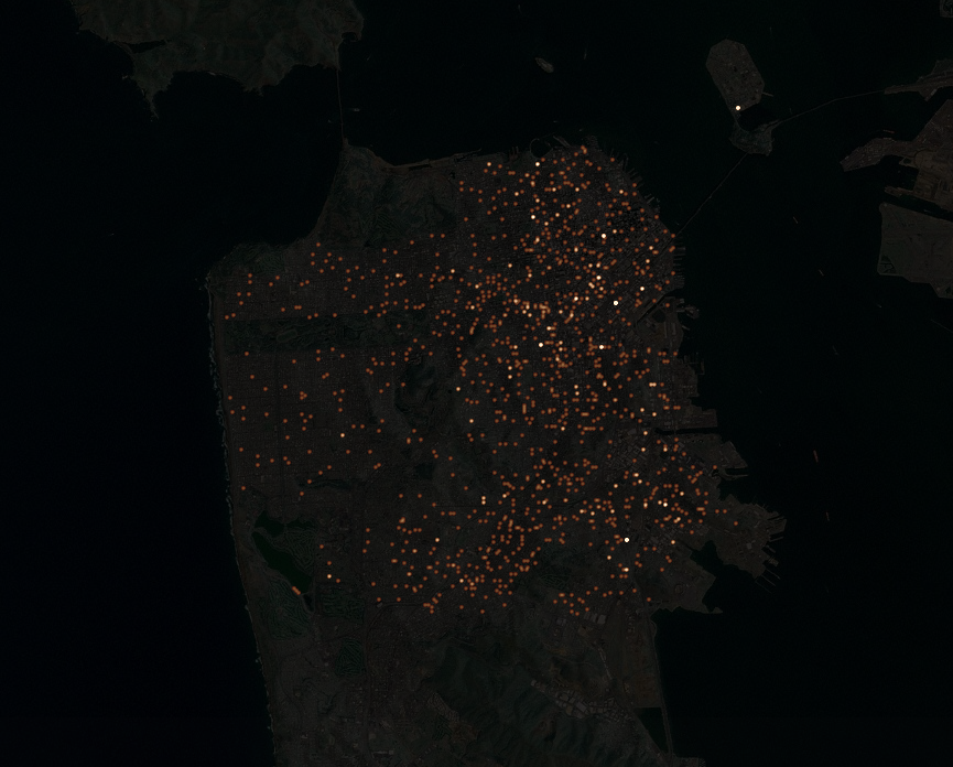
I’ve been playing with different ways of representing data (see my previous night lights example) and I decided to venture into 3D representations. I’ve used a full year of crime data for San Francisco from 2009 to create these maps. The full dataset can be download from the city’s DataSF website.

A view from above

This view shows different types of crime in San Francisco viewed directly from above. The sun is shining from the east, as it would during sunrise.

top_500

I love how some of the features in these maps are pretty consistent across all the crime types, like the mountain ridge along Mission St., and how some of the features only crop up in one or two of the maps. The most unique map by far is the one for prostitution (more on that further down).

An alternate view

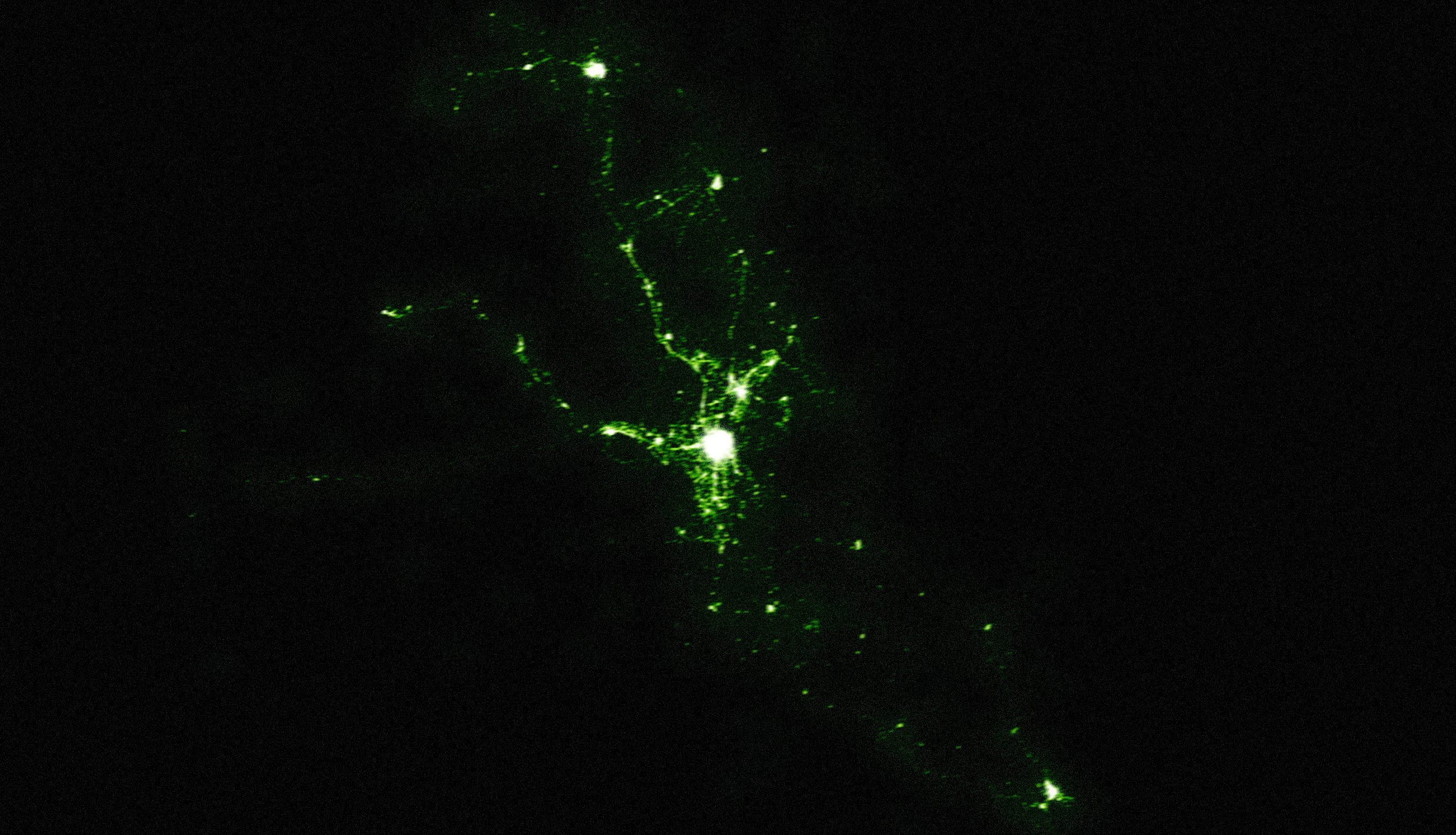
Here’s the same data but from a different angle, which helps show some of the differences.

UPDATE: Whoops, I screwed up originally and had a duplicate image. The original graphic showed the same map for Vandalism and Assault (both were the Vandalism map). This updated graphic has the correct map for Assault.

right_500_2

Many of the maps have peaks in the Tenderloin, which is that high area sort of in the north-east center area of the city. Some are extremely concentrated (narcotics) and some are far more spread out (vehicle theft).

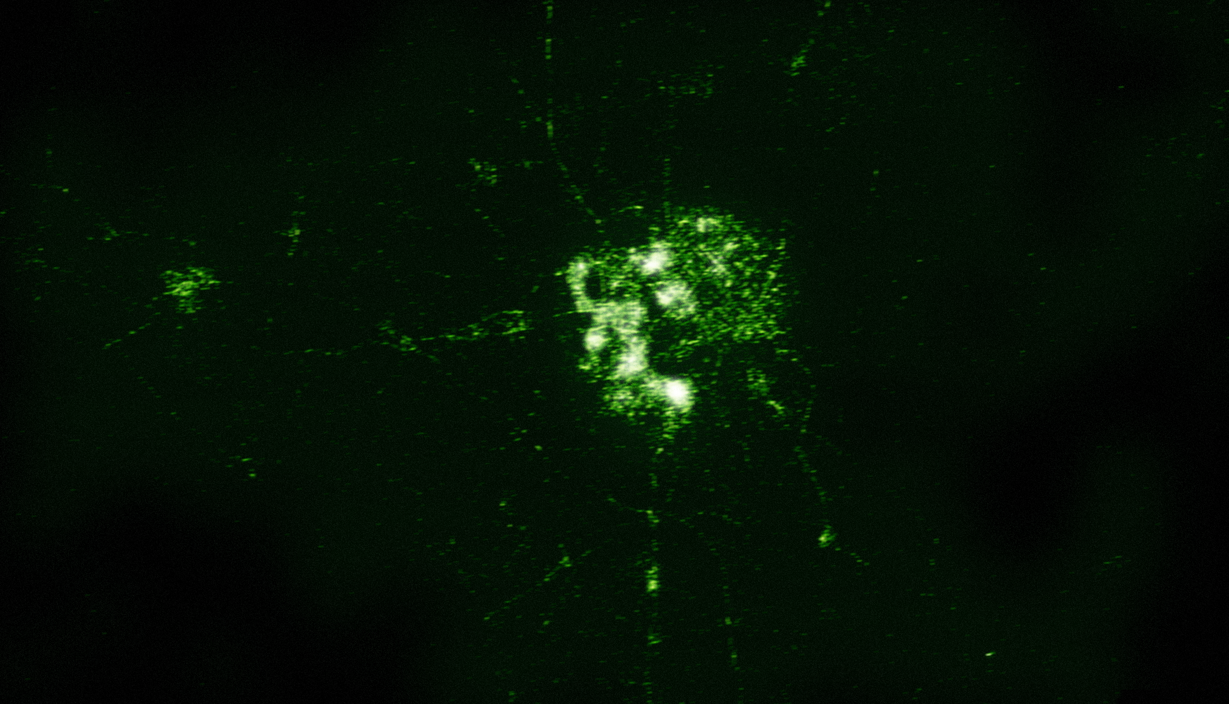
My favorite map is the one for prostitution (maybe “favorite” is the wrong choice of words there). Nearly all the arrests for prostitution in San Francisco occur along what I’m calling the “Mission Mountain Ridge”, which runs up Mission St between 24th and 16th.

EDIT: I’ve been corrected. Upon closer inspection the prostitution arrests are peaking on Shotwell St. at the intersections of 19th and 17th. I’m sure the number of colorful euphemisms you can come up with that include the words “shot” and “well” are endless.

I love the way the mountain range casts a shadow over much of the city. There’s also a second peak in the Tenderloin (which I’m dubbing Mt. Loin).

prostitution_500

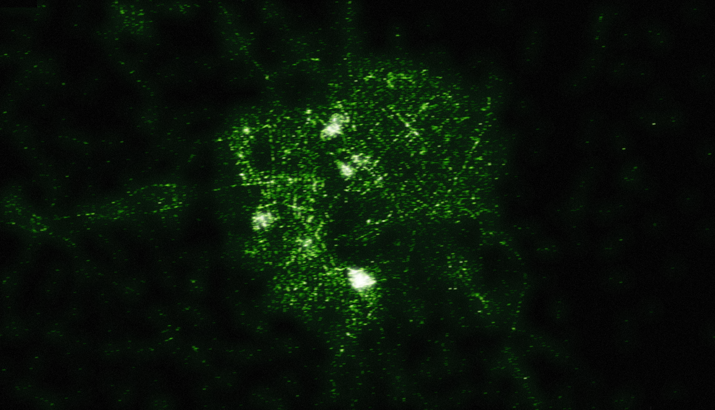
Drug crimes are also interesting to look at, since so much of the drug activity in San Francisco is centered in a few distinct areas. We can see Mt. Loin rising high above all the other small peaks. The second highest peak is the 16th St. BART peak.

drugs_500

There are other consistent features in these maps, in addition to Mt. Loin and the Mission Range. There’s a valley that separates the peaks in the Mission and the peaks in the Tenderloin, which is where the freeway runs (Valley 101). You’ll also notice a division in many of the maps that separates the southeast corner. That’s the Hunter’s Point Riverbed (aka the 280 freeway).

Disclaimer

These maps were generated from real data, but please don’t take them as being accurate. The data was aggregated geographically and artistically rendered. This is meant more as an art piece than an informative visualization.

Standard
Art, Data Visualization, Maps, SpatialKey

Data Visualized as City Lights at Night


Images courtesy of the Image Science & Analysis Laboratory, NASA Johnson Space Center

As I was flying back home into San Francisco airport I was watching the city lights out the window and got struck by a bit of inspiration. I find cities beautiful, from the graffiti to the neon signs to the line of headlights on the highway. A city viewed from above at night is captivating. I wanted to try to recreate that same look, but by visualizing data (in one sense you can say that the real view of a city from above is already a visualization of population data).

I started searching for images of cities at night, and found these amazing images from NASA. All those images were taken from a space shuttle orbiting the earth. These images tell you a lot about the city, the layout, urban density, planning (or lack thereof). I wanted to take other meaningful data and create similar images.

All the visualizations below have been created with SpatialKey. However, this is some experimental work I’ve been playing with to generate the “night light” images, so it’s not released (and might not ever be). Basically this is a peak behind some of the R&D work I do for fun (yes, for a dataviz dork like me making fake “cities at night” images is my idea of fun).

Crime in San Francisco

This image is all crime in San Francisco for a 3-month period. You can see some of the same features that you can see in the NASA space image, such as Golgen Gate Park and the Presidio (the area on the north-west edge of the city). All in all it’s interesting how similar the crime image looks compared to the NASA image. Downtown is the brightest spot in both images, which means that it’s literally the brightest area of the city (the most streetlights), and also has the most crime.

SF_crime

And here are breakdowns for a few different crime types. Notice how different the distributions are. Narcotics crimes are heavily clustered and can be found downtown (in the Tenderloin), in the Mission (near the 16th St BART station), and along Haight Street near Golden Gate Park. Whereas vehicle theft is scattered fairly evenly throughout the city.


Graffiti Reports in San Francisco and New York

Both San Francisco and New York publish their 311 data, which is when citizens call for city services. One category of 311 calls is to report graffiti. Graffiti is interesting in that it often follows specific city streets. When we look at the graffiti data for both cities we see specific streets that have far more graffiti than others. I love these images (particularly the one of SF) because they really look like a view of street lights from a plane.

NYC_graffitiSF_311_graffiti

Trees planted in San Francisco

Another one of my favorites of this set is data for all the trees that the city of San Francisco has planted since 1990 (all this SF data is available at datasf.org). You can see the heavy planting along Market St (which cuts diagonally through downtown), as well as along streets like Sunset Blvd (the street running north/south on the western side of the city).

SF_trees

Street lights (or SF as a giant lite-brite)

One final image of San Francisco we have is the locations of every street light in the city. I liked this image because it reminded me of playing with a Lite-Brite when I was a kid. It almost makes city planning feel light a grown-up version of playing with little plastic lights.

SF_traffic_lights

Standard