Now that Flex is being moved to the Apache Software Foundation, it’s time for a new logo. A logo contest is currently underway (ends today I think). Here are my two submissions. Each one has more detailed variations and explanations of the thought process if you view the full submission.
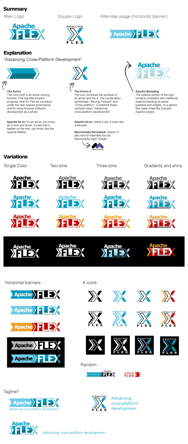
Logo 1
Main Themes: Cross-platform, progress, advancing forward, new beginnings
This logo is meant to combine the symbols of an arrow and an X. The arrow means “moving forward”, which has a number of connotations (moving forward with Apache, a fresh start for the project, advancing the state of the art in web/desktop/mobile development). The X means “cross platform”, which should be pretty self-explanatory to anyone who uses Flex. The combination of the two symbols means “Advancing cross-platform development.”
![]()
See the full treatment with explanation.
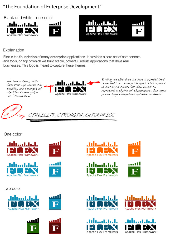
Logo 2
Main Themes: Stability, strength, enterprise
The second logo tries to capture the enterprise story. Flex is the foundation of many enterprise applications. It provides a core set of components and tools, on top of which we build stable, powerful, robust applications that drive real businesses. This logo has Flex as a strong base. Built on top we have a symbolic chart, but this symbol is also meant to represent a skyline of skyscrapers. Our apps power large enterprises and drive business. Flex is the foundation of enterprise development.
![]()
See the full treatment with explanation.
I like “Logo 1” variant, it looks professional and very attractive.
The second logo clearly conveys your visualization background…
I think the logo they got it awesome.