

In 1990 I was an eight year-old kid. And like most eight year-olds I spent a lot of time in front of my TV. But the summer of 1990 was different. Instead of cartoons I was watching the first Gulf War.
The television media coverage of the war was everywhere. Except these weren’t the gruesome images of the Vietnam era. These were images that looked more like videogames. We had cameras attached to bombs that used night vision and targeting scopes as they dove into buildings. All the images were a bit fuzzy, a bit grainy, either tones of gray or green, and overall void of emotion.
But we were watching people die.
The disconnect between the emotionless images shown on TV and the reality that they represented has always stuck with me. The fact that we could (and still do) present something so horrible in such a clinical, disconnected way makes my head spin.
WikiLeaks Iraq data
I’ve been experimenting with mapping the recently released data from WIkileaks that documents deaths in Iraq. All told the data documents 108,365 deaths, which we assume are just a fraction of the true casualty count from this war. Of those deaths, 65,641 were civilians.
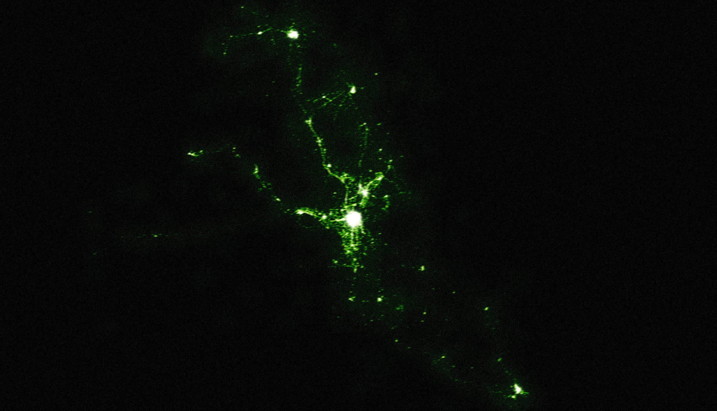
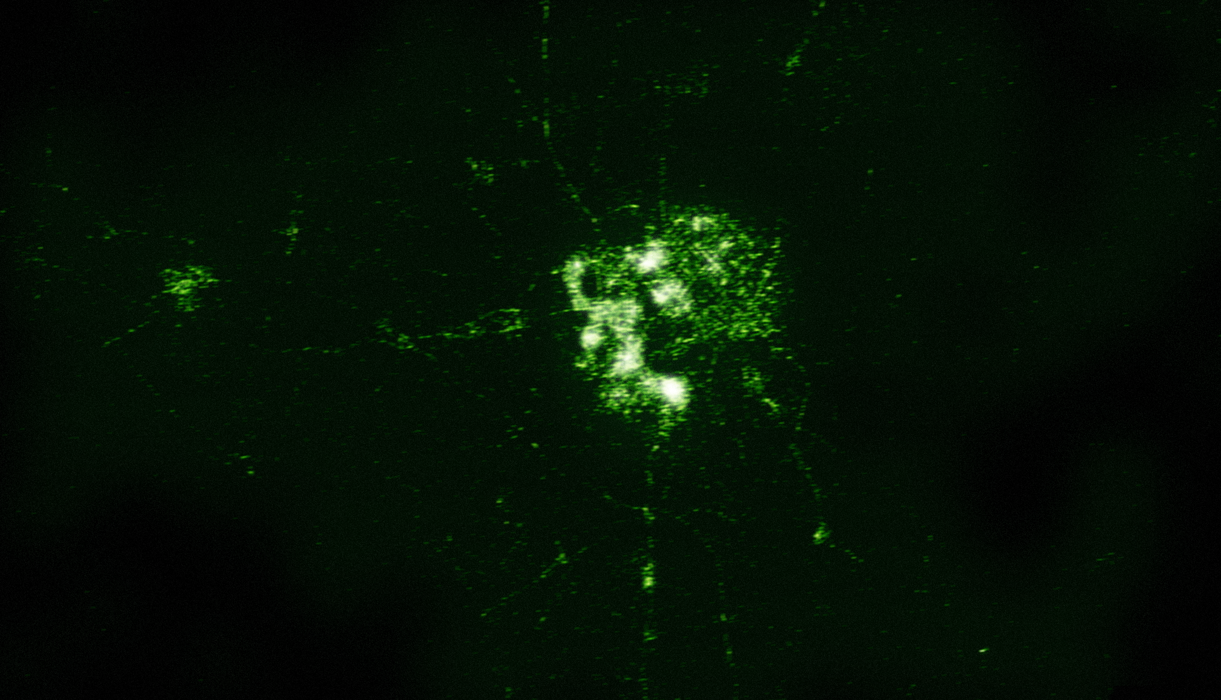
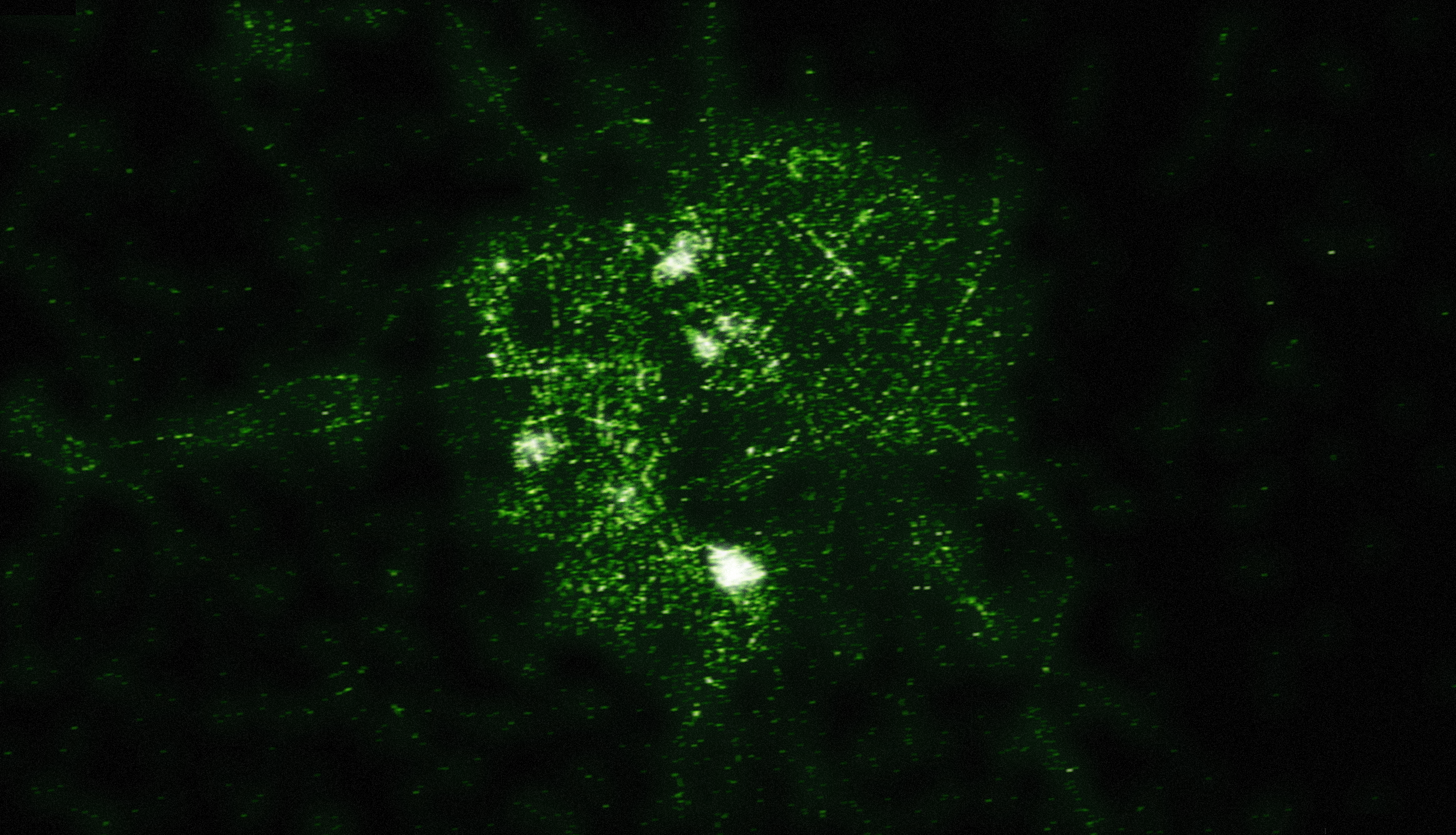
I’ve used SpatialKey to produce some heatmaps of these deaths by recreating the aesthetic of the night vision images we’ve grown so used to seeing. I downloaded the data from the compiled spreadsheet published by the Guardian. Each image has a high resolution version available (2,474 pixels by 1,419 pixels).
A view of the entire country

A closer look at the area of Baghdad

More details of Baghdad

Why?
These images are meant to be a bit provocative. Every tiny blurred dot represents someone dying. And yet it’s all presented in a way that everyone is comfortable with. When you glance at these images you don’t immediately think of killing. We’re so used to seeing emotionless, blurry images of rockets exploding and precision bombs targeting buildings that we disconnect the image from the reality. These are images of death. And the fact that we’re comfortable looking at them should give us pause.
Awesome work! Also shows where not to live if you are planning to move into that area.
Pingback: Daily Digest October 28th
With the underlying story these kill maps are very provocative.
Politics, art and technology converge.
I’d love to see this in some exhibit 10x larger in highres with the fact of what it represents somehow revealed afterwards.
It definitely made a big impression. At first glance without reading i thought what kind of cool visualization is this (expecting cool stuff on this site)? then i read the article and yeah, your point is definitely made… i paused
Arnoud
Pingback: Data Visualisation – A brief insight | Chris Herring